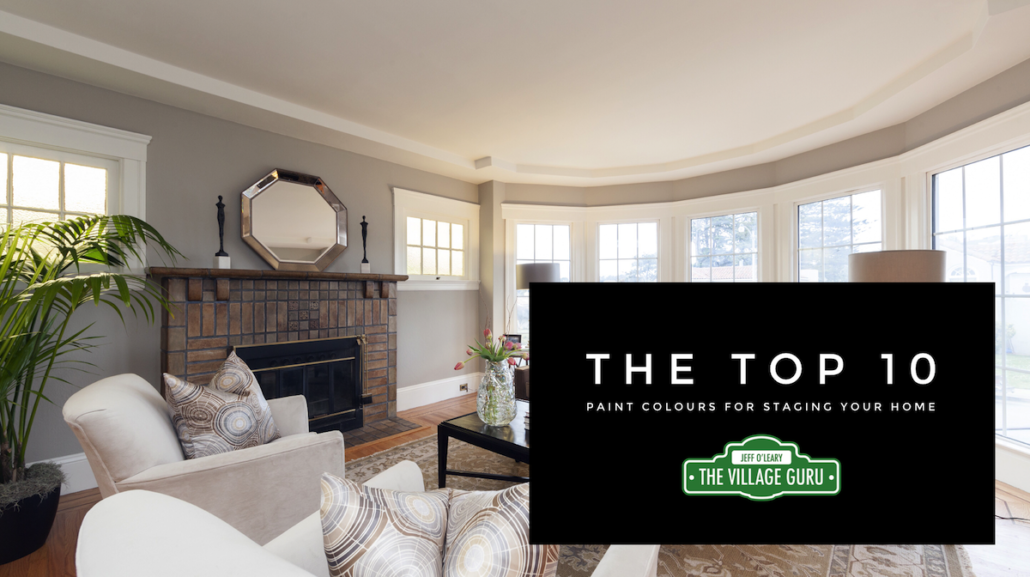
Top 10 Paint Colours
I have been on hundreds of staging consults over the years, and it seems that time and time again, there are some paint colours that just work. No matter the style of furniture, size of room, choosing the right paint colour always add a sense of elegance and style without being the star attraction.
For the purpose of home staging, you want buyers to notice your best features, like wood floors, big windows, woodwork and fireplaces. These are the features of the home and we want to stand out. Think of paint in the role of Best Supporting Actor, as it helps to enrich the overall feeling without taking the lead. These Top 10 Paint Colours do just that.
Along that line of thinking, you’ll definitely notice there are no bright colours that hit the list of top ten paint colours for staging your home. We don’t want the paint colour to take over the house, or to be the first thing buyers notice. Often bright colours detract from the good features of your home, and that’s why for selling, they are a big NO-NO.
Detach your personal style from your home and consider that your job is now to showcase your home as close to a model homes as you possibly can. The more neutrally elegant you can make your home, the more buyers you will attract.
Though I had to cut this list to Top 10 Paint Colours, I actually have 11, because I just couldn’t cut it down. And really, there’s more like 20-30 colours for selling your home that are fantastic. The colour you should choose will depend on your flooring and furniture finishes. I always recommend having a Staging/Paint Consultation done before you prepare your home for sale, so that you do it right the first time.
This article is always one of our most popular articles, and I have made some updates for this year. I have divided the colours into 3 categories: light shades, mid-tone shades and darker accent colours. Successful staging ISN’T about beige, beige and beige. So read on to see my updated Top 10 Paint Colours list.
All of these Colours are Benjamin Moore
Light and Airy Paint Colours
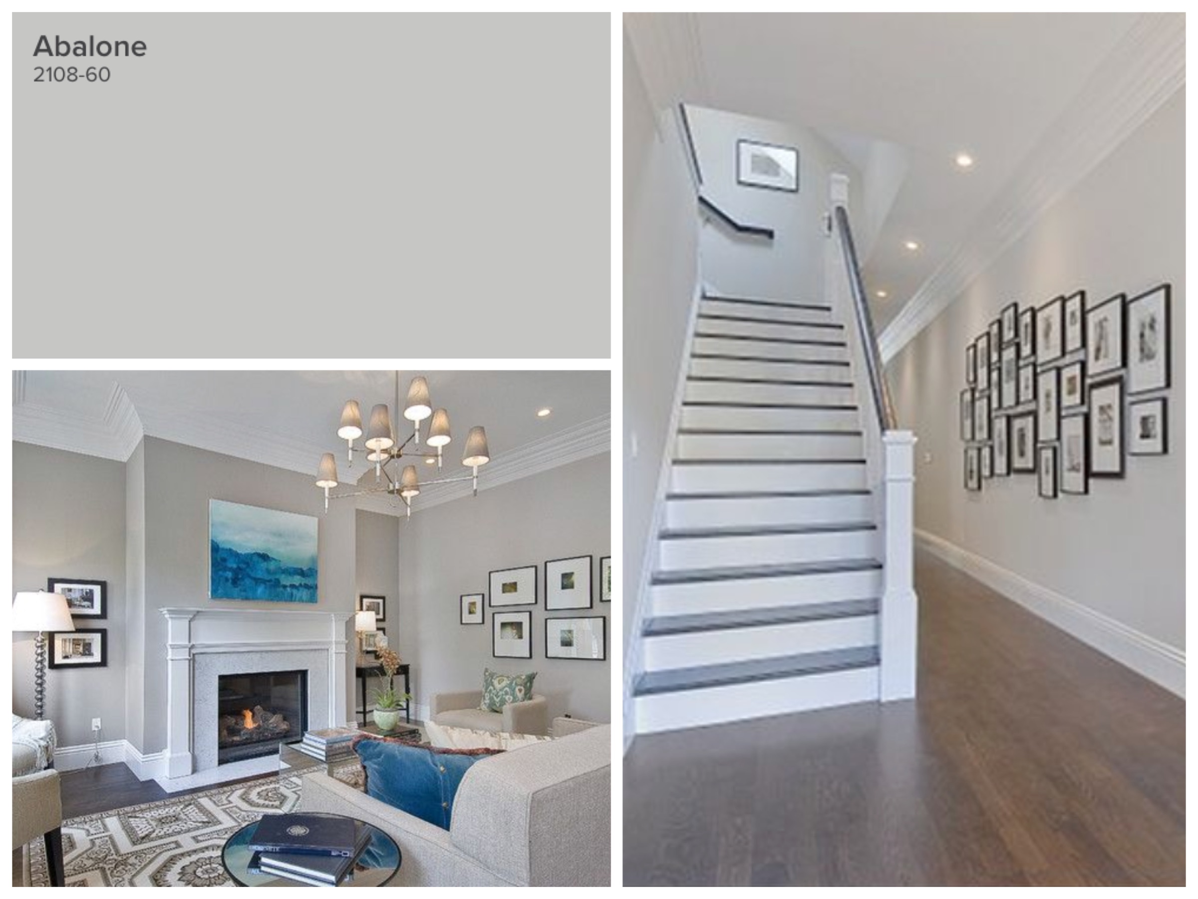
Abalone is a wonderful chameleon colour; sometimes it looks a little brown, sometimes a warm grey. It can work with light and dark floors and is a good all-around colour for hallways, living rooms and bedrooms. It looks great with light and dark tile or wood floors. It’s versatility is its greatest asset. I love pairing it with it’s darker sibling, Silver Fox (see later down in the article).
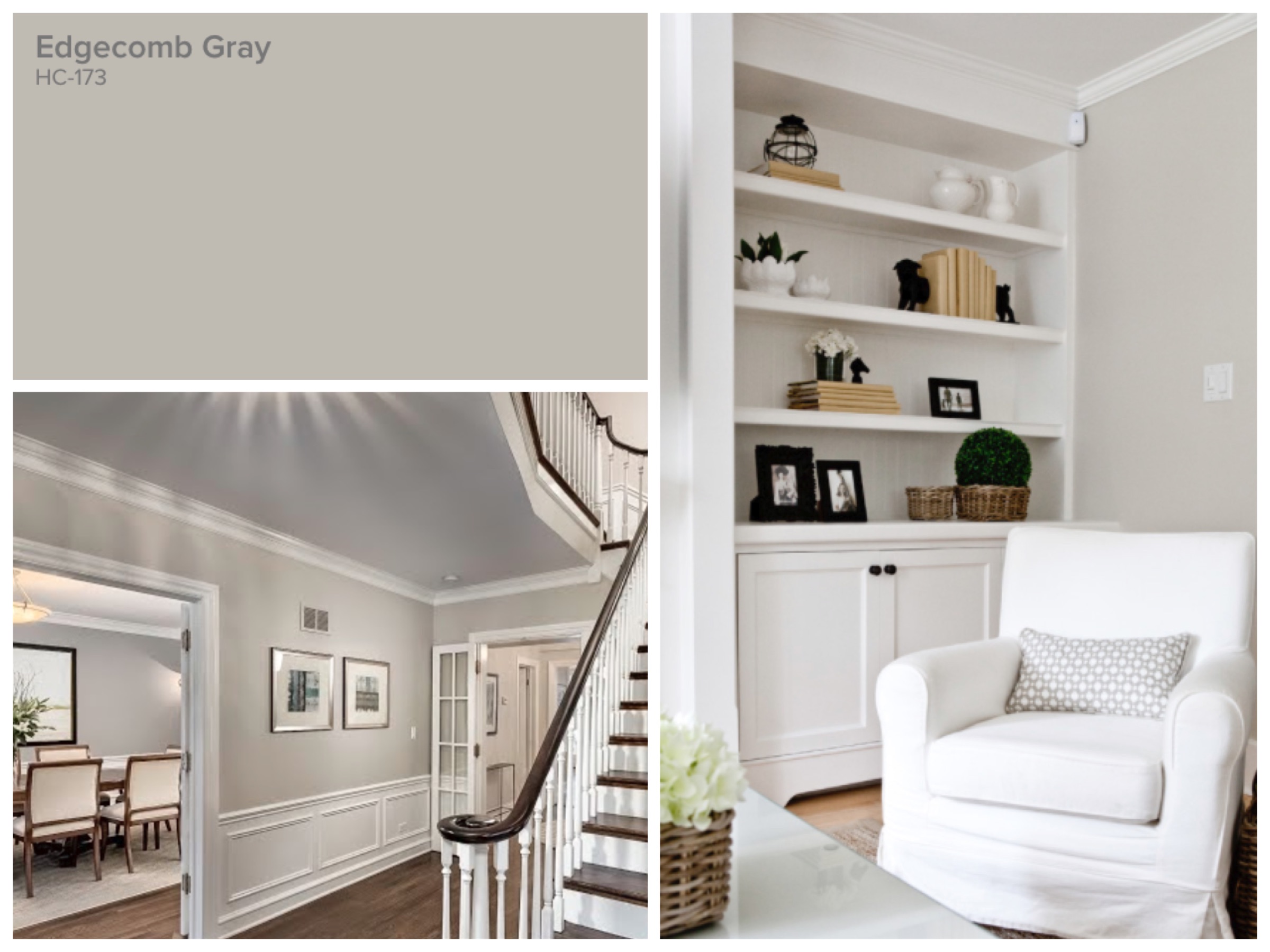
Edgecomb Gray is my next most popular colour, it works in almost any home. In darker homes, where natural light is an issue, this is a good choice as it helps to make the home feel as airy as possible. It works with almost any tone wood floor, and a variety of tiles as well. It looks great with tons of white as accents.
Article continues below
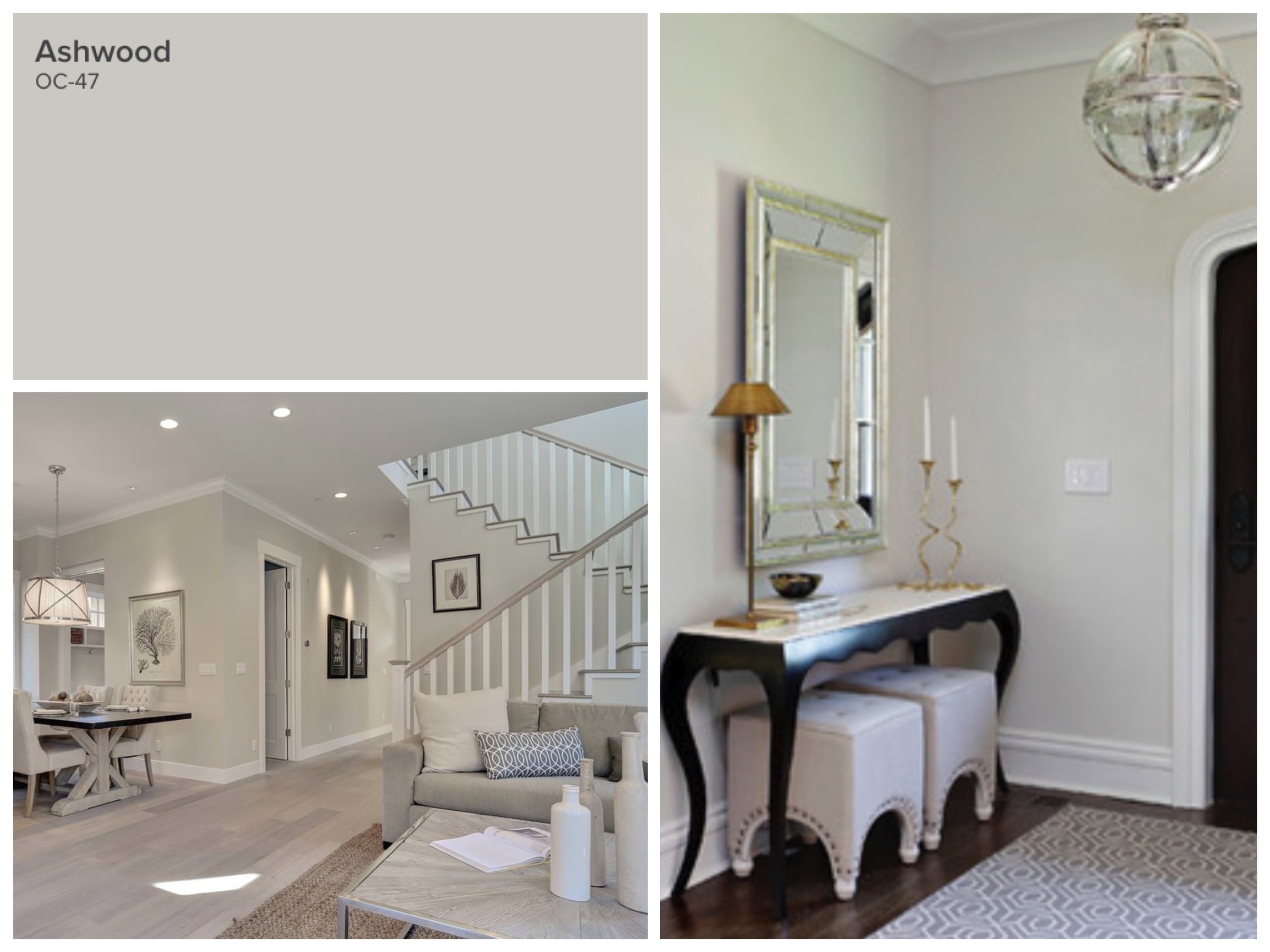
Ashwood has much of the same properties of Edgecomb Gray, but can take on a green hue in certain lights. If there’s any cream or yellow in the room, it’s not ideal. But with darker wood, Ashwood can be the perfect hint of colour while still being a neutral.
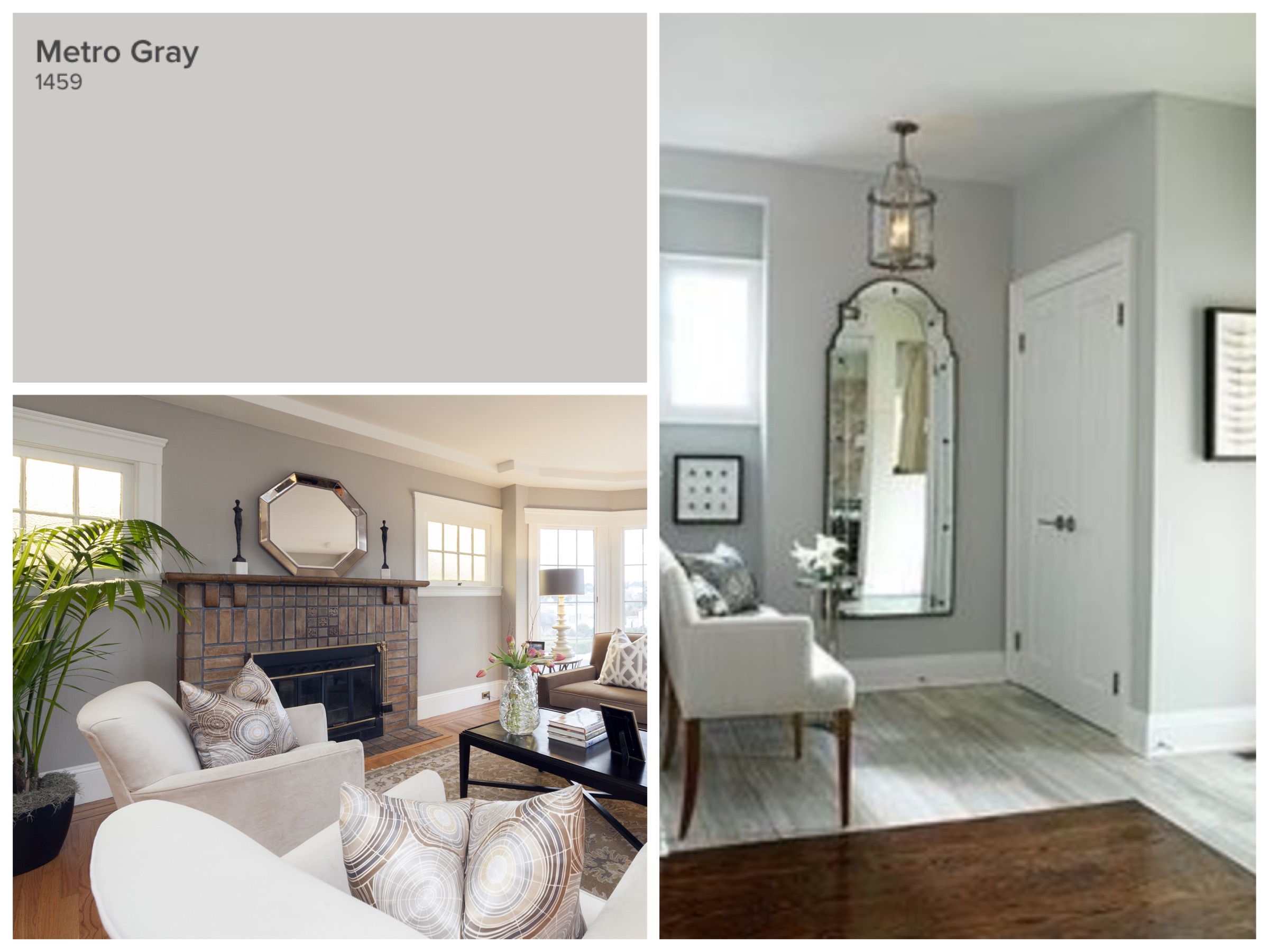
I know grey gets a bad wrap sometimes, but it only looks cold when used in the wrong applications. I like grays that have a touch of warmth, but still do read as a grey. Metro gray looks best with warm mid-tone walnut wood, and white marbles – Calacatta, Carrara, Statuario, etc.
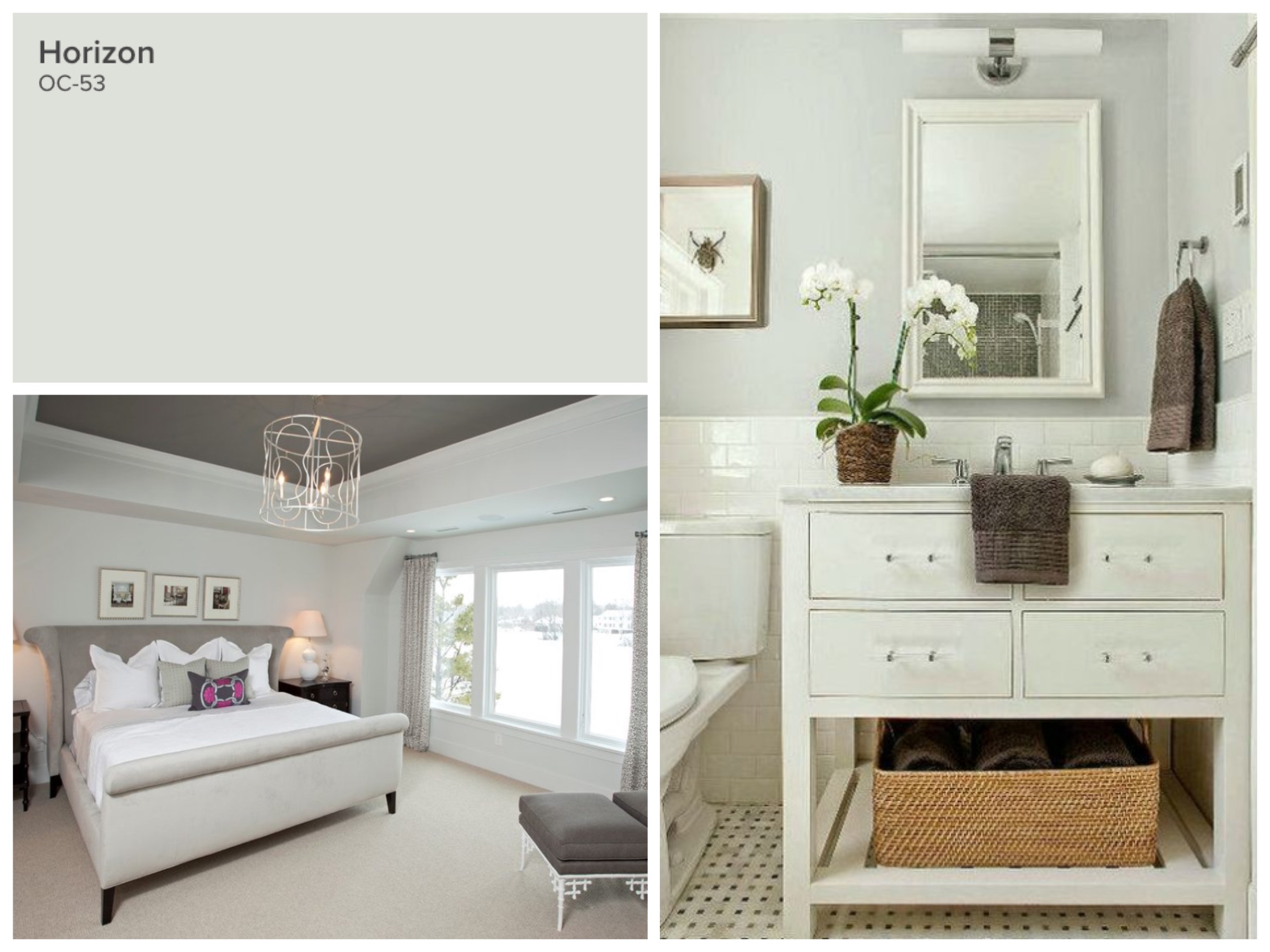
Horizon is the ultimate neutral that offers pale, calming colour. It’s blue, but can read slightly blueish-green in certain lights. Use it in bathrooms, laundry rooms, or any living areas with beige carpets. Every room needs colour and contrast, so if you have cream or beige on your floor, you do NOT want to put a similar tone on the walls. Opt for a neutral blue like Horizon.
Mid Tone Paint Colours
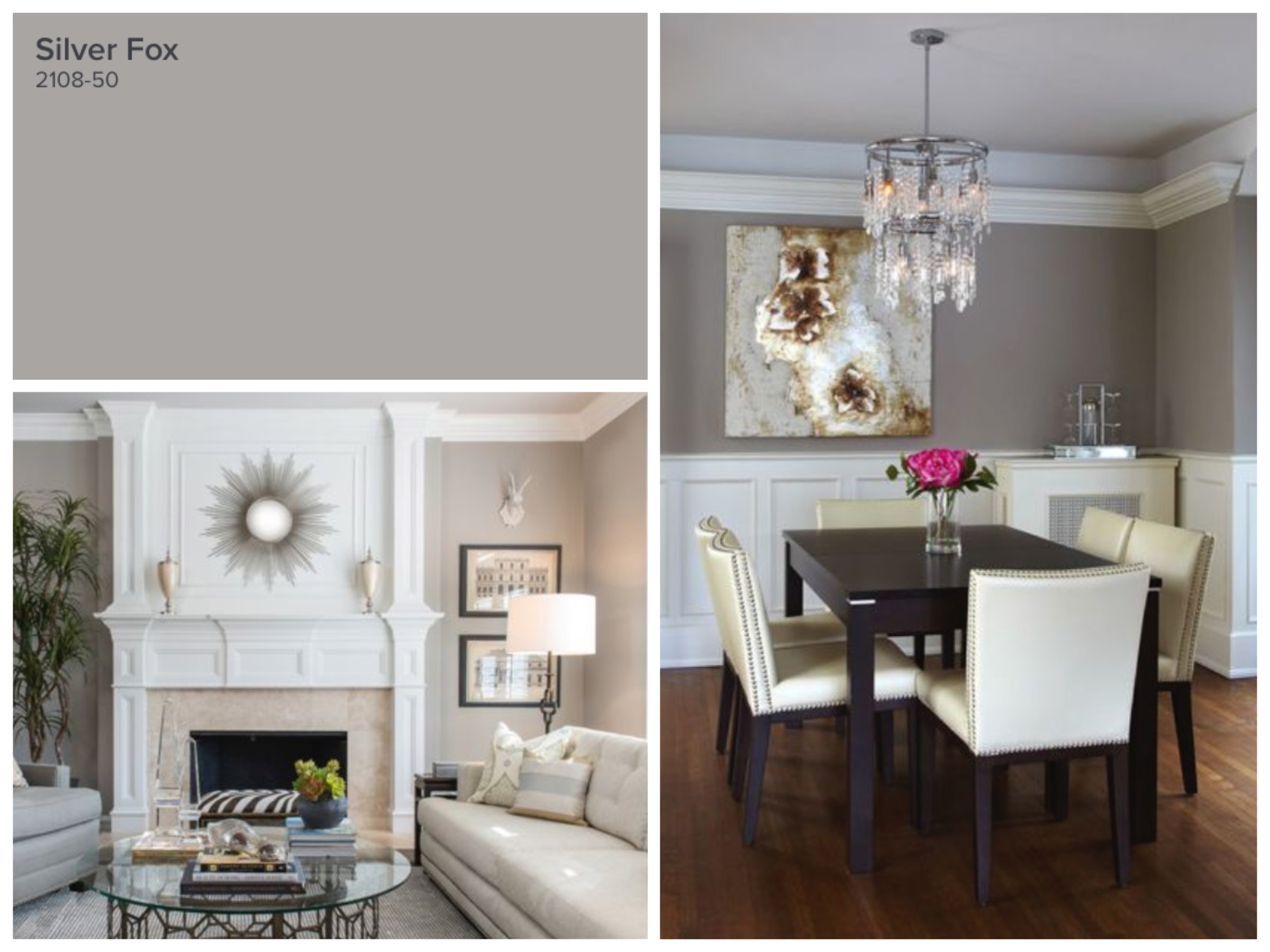
Silver Fox is a luxurious and rich colour that is not too dark for your walls. Most people often want to choose the lightest shade on the paint deck, but the lightest colours rarely translate well in listing photography. You need richness without being overpowering and that’s what Silver Fox is. If you were to choose Abalone for your hallway and/or kitchen, choose Silver Fox for your living and dining room for a coordinated, sophisticated look.
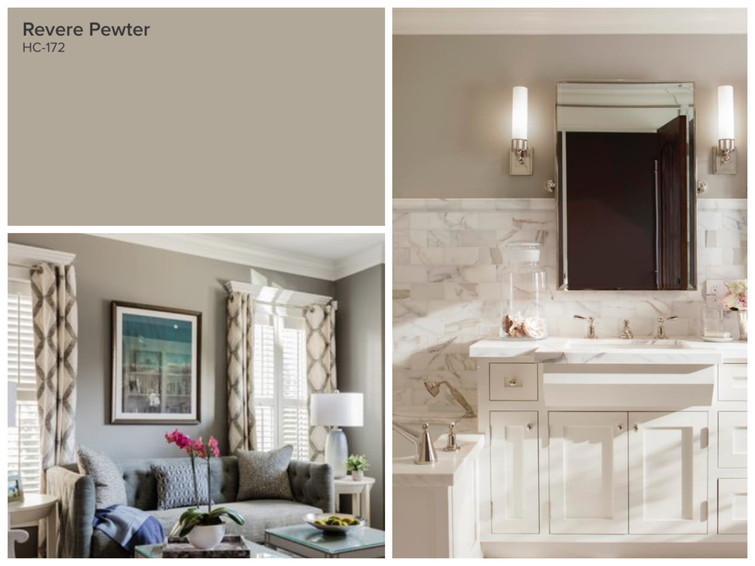
Revere Pewter had to make the list although I have to admit, I don’t use it all that often. But so many people do and you can see endless photos of this colour being used beautifully. It is best when you have brown tones you are trying to work with, but are looking to downplay it into a greyer shade. The picture with the white and brown marble is the ideal way to use Revere Pewter.
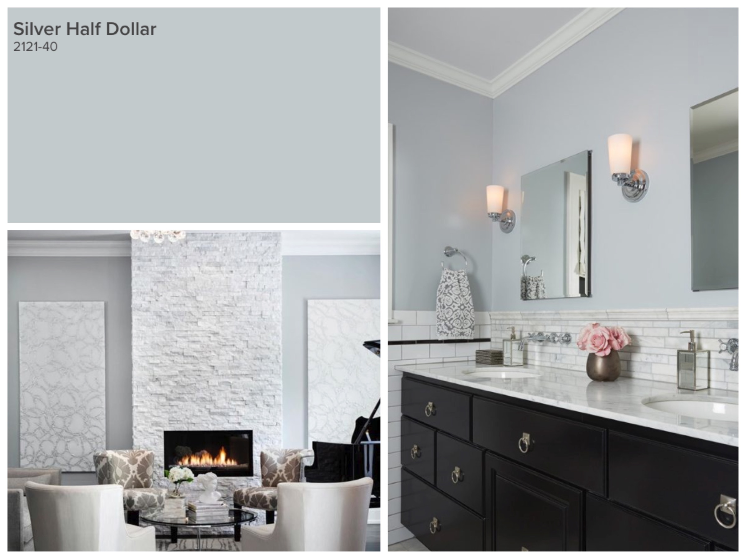
Silver Half Dollar is definitely blue, but has enough grey to keep it from looking juvenile. It is truly a very elegant colour. Not to be used in a 15 gallon bucket all over your house, but can be used strategically to break up too much neutral grey or brown. It always looks great in bathrooms, or any room that has lots of white architecture like an eat-in kitchen with white cabinets. In the bottom-left picture, Silver Half Dollar looks great in this living room because of the white stack-stone fireplace, white art and cream furniture. If you have a room with lots of white, and want to have some colour, this could be a great choice.
Dark Accent Paint Colours
I updated the article this year to include dark accents, because I fear too many houses miss those critical focal points that make listing photos attractive and interesting. If you have a gorgeous fireplace with built-ins, a coffered ceiling, wainscoting walls, or huge windows, then with a ton of white trim, a neutral wall works well enough. But what if your room is missing all of these things? What is the eye supposed to look at? This is where dark accent colours are ideal. They help to strengthen focal points, and are used in small but strategic ways. It might sound scary to choose a darker colour, but these three colours below are hands down winners used many times with great success.
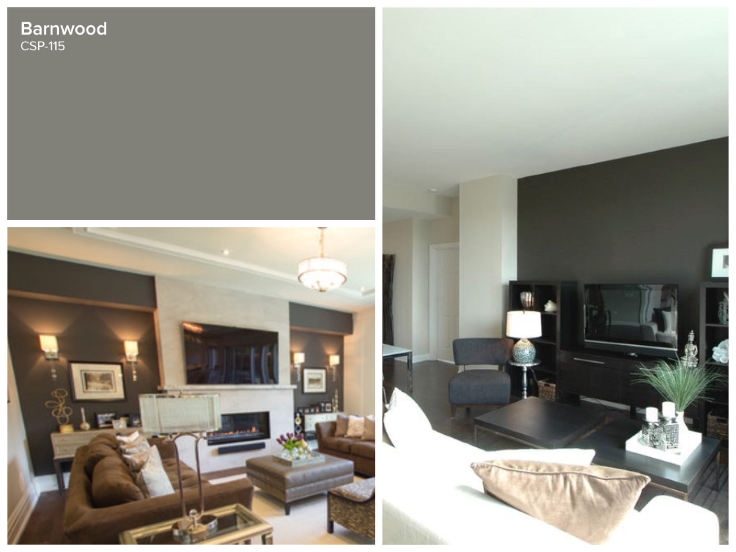
I love using Barnwood to both highlight and camouflage. Its definitely brown but has enought grey that it doesn’t feel like the 1990’s chocolate brown. For listing photography, its important to know that electronic equipment NEVER looks good; often its distracting and looks messy. So for a TV wall, or an office wall where you have all of your electronics, this is the perfect colour to visually hide the mess. Alternatively, it also does a great job to highlight a light fireplace. Remember that we will layer furniture and art in front of the paint, so it will look rich and interesting. Don’t get caught in the feeling that it’s too risky or fear that buyers will hate it. Buyers always appreciate a well styled room that looks tailored and interesting.
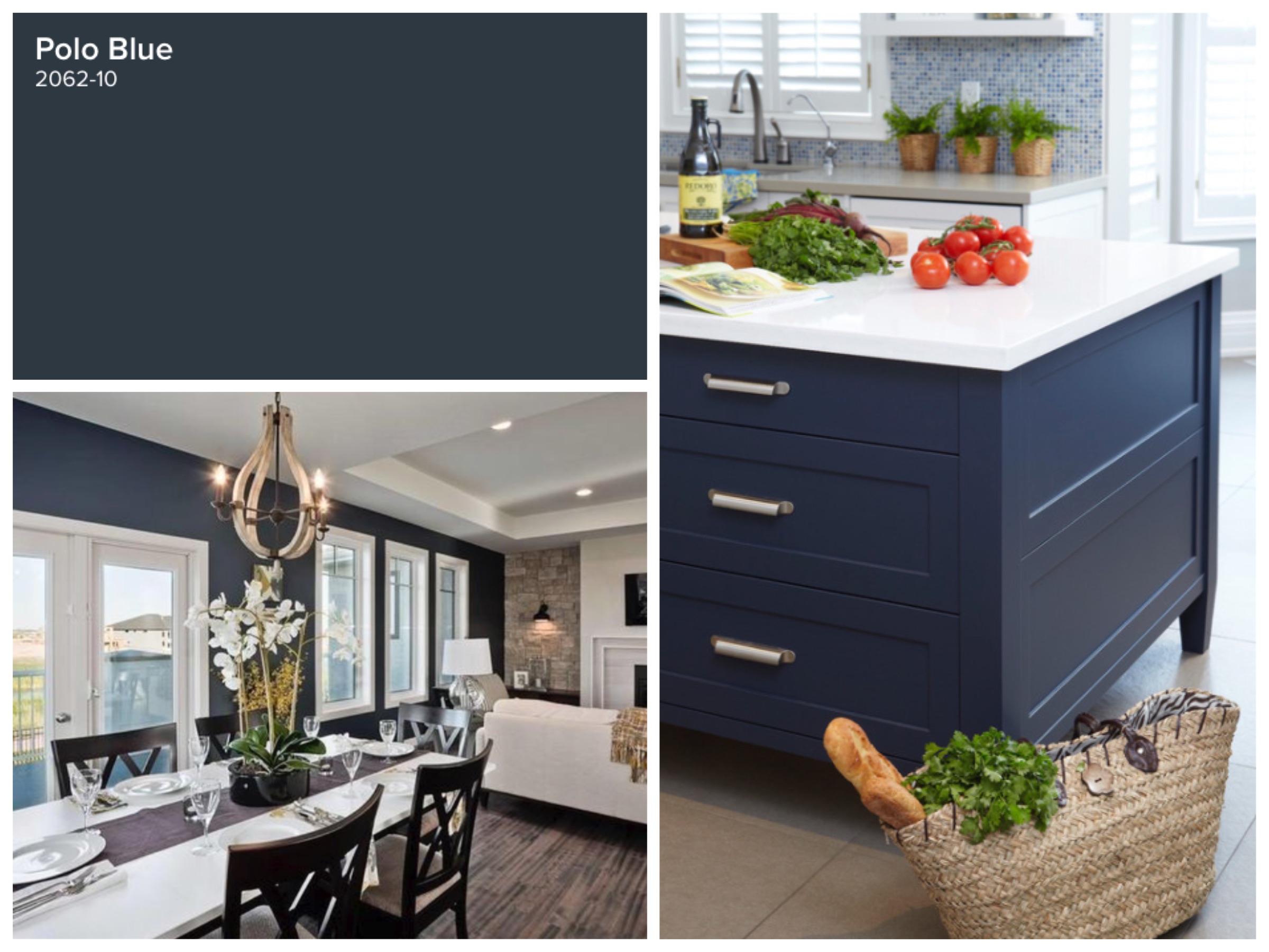
Polo Blue is my absolute favourite colour right now. It’s neutral, it works with tan, beige, light grey and white. It adds the drama that you get from bright and bold colour but its sophisticated and deep. It’s sexy like black, but a little softer. I have used it quite a bit in white kitchens where there’s relatively little wall space. You get a punch of colour but its not overwhelming because of the white. My other favourite application is if you have a kitchen island or bathroom vanity that’s looking worse for wear. Painting out a cabinet in Polo Blue adds contrast, interest, and will look classic for many years to come.
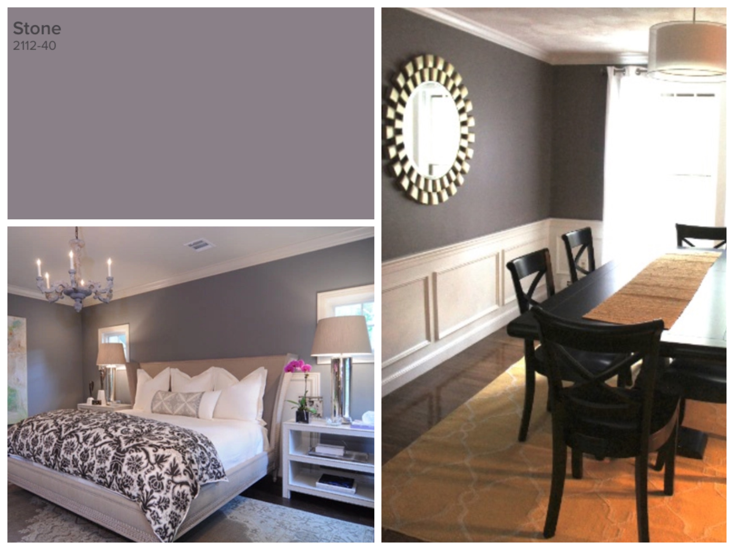
New to the roster is the colour Stone. As mentioned, most people have grown weary of the charcoal grey and cement grey that can feel very cold. Stone is more of a dark mauve, with some grey added in to give it more neutrality. My favourite application is in a bedroom, because bedrooms are supposed to be romantic and restful and feel like a retreat. As long as you balance this colour with lots of white or cream, you can use it on all the walls. You can also use this colour as an accent on the bed wall, and then cut the other walls down by 50-75% white.
A Paint Colour Consultation is Critical
These are all lovely colours, but the truth is, any of them can go wrong if put in a space with the wrong lighting or against fixed elements that clash with the paints undertones. It’s fun to write this list, and if you have a nice white bathroom and you want to paint your vanity Polo Blue, then I can say with blind confidence that you should do it and it will look great. But the greys and taupes and neutrals are a tricky beast. Some have a green base, some will look too brown, or some will make your cabinets look dull. I urge you to contact us for a Paint Colour Consultation, which you can get for $250 if you mention this post, or it is included FREE in our long list of services when you list your home with The Village Guru. A good plan is the foundation of all success, and we are here to build you the best strategy in the industry.


