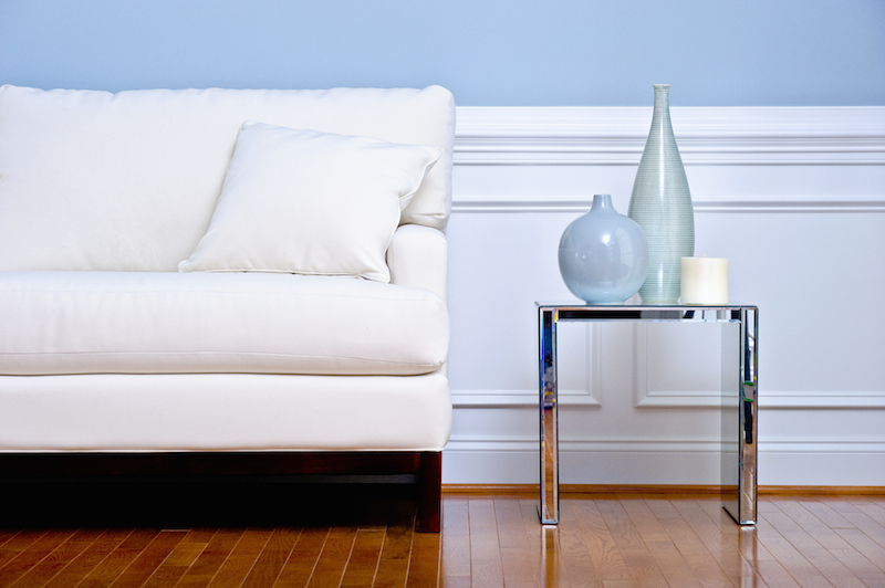
Every once in a while I’ll come across something, say a charming stool, or a random throw pillow, that will go great in my next home design project. Of course, the moment I spot it, this “something”, in its splendid, unique loveliness, demands me to rescue it from its humble circumstances (usually propped on a neglected store shelf or hiding in a dusty corner of an antique shop) and take it home with me. And so I oblige.
But sometimes, a peculiar thing seems to happen to this random piece of loveliness the moment it crosses the threshold of my front door. The stool destined for the perfect spot under a large, dominating piece of artwork is dwarfed by it and looks completely off scale, and the throw pillow goes from a soft, muted mustardy-gold to a loud buttercup yellow the minute it lands on my sofa. Why? What happened? Well, it probably had something to do with me missing the mark on the basic principles and elements of design. These principles and elements are generally what guide a designer or decorator when pulling together a fabulous space and help them avoid those impulsive and misguided purchases of bossy yellow pillows and diminutive stools. Thinking about scale, emphasis, proportion, balance, rhythm and colour, to name just a few, is what makes a room’s design outstanding. Here are a couple of examples of two rooms, one eclectic, one contemporary, whose designers paid attention to these principles and elements to make bold, original and dynamic spaces that work.
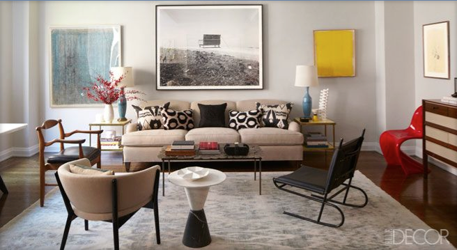
Interior Designer Tamzin Greenhill’s Manhattan apartment featured in ELLE DÉCOR
WHY IT WORKS:
Tamzin Greenhill’s living room is an eclectic mix of styles, periods and colours that work beautifully together because she paid attention to some key principles of good design.
The first is that of variation and contrast. A quiet backdrop of neutral tones and quiet patterns in creams and grays in the rug, wall colour and sofa provides a solid jumping off point for some of the other more dynamic pieces in the room like the red Vernon Panton chair, the strong lines of the black metal Jacques Adnet chair or the artwork in its commanding scale and vibrant colours. The contrasting pieces in this room create impact and lend the space dynamism while the generous use of solid neutrals help to keep the design grounded.
Secondly, symmetry and balance have been used with great effect in this room. The matching side tables, lamps and toss pillows provide just the right amount of uniformity to keep this eclectic design tight. As well, there is a sense of balance in the scale of the furniture pieces placed around the room that also helps lend a sense of orderliness to the space.
Further, colour has been used strategically both in repetition and placement. There is a sense of rhythm in how our eye follows the pops of red used throughout starting from the flowers on the left to the book in the centre of the coffee table to the chair on the right. Follow the teal blue tones in the artwork to the table lamps and then follow the yellow artwork on the right to the side tables.
Lastly, consider how the artwork has been placed on the wall. Though each piece is different, they have been positioned at the same height around the room and at even intervals. Skinny frames is another common element that unifies this composition, providing a sense of flow and rhythm.
This room’s design has been beautifully considered with all design principles and elements combined to create a sense of harmony and flow in this fantastic, interesting and eclectic space.
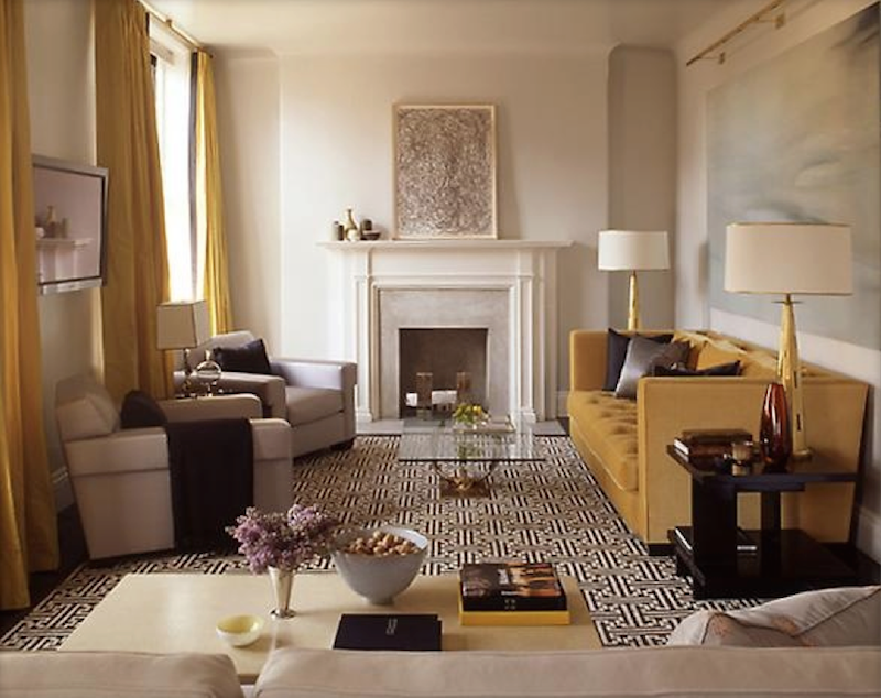
Designer: Steven Gambrel, Photographer: Eric Piasecki, Source: Time & Place (2012 Abrams) by Steven Gambrel available through Amazon.ca
WHY IT WORKS:
Steven Gambrel has used scale and proportion, pattern and colour to create a beautiful room that exudes luxury.
First, notice how the size of the two club chairs on the left balance the size of the sofa on the right. Immediately these pairings complement each other nicely providing a strong sense of symmetry. Scale is also evident in the side tables, the lamps and the furniture arrangement in the foreground. Notice as well the height of the drapery versus the scale and height at which the artwork over the sofa has been hung. Neither one overwhelms the other. Instead it is a pleasing blend of elements that harmonize beautifully together. The fireplace, whose proportions and classic lines repeat those in the furniture and other pieces in the space, helps to carry the theme through the room unifying the design.
Finally, the use of pattern and colour has been used so cleverly here. From the more obvious splashes of muted yellows in the drapery and sofa to the subtle black, whites, grays and creams that repeat in the mantle artwork that in turn plays off the graphic area rug that pops against the complementing club chairs. Coordinating throw pillows and blankets in blacks and deep grays add a bold punch that keeps the rug from getting too bossy in this room, but their solid pattern means they don’t compete with it visually. I also love how Gambrel used a glass coffee table to allow uninterrupted sightlines of the area rug and, perhaps more importantly, to play off the watery effect of the artwork. I think the two work beautifully together and are a perfect complement to the other robust elements in the room.
Gambrel combined some key principles of design to pull together a classic, contemporary and bold room that exudes luxury and comfort combining clean lines and soft hues with oversized pieces and lively patterns that work together to create a dynamic, yet welcoming, space.


