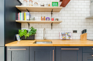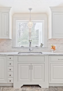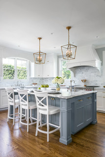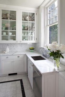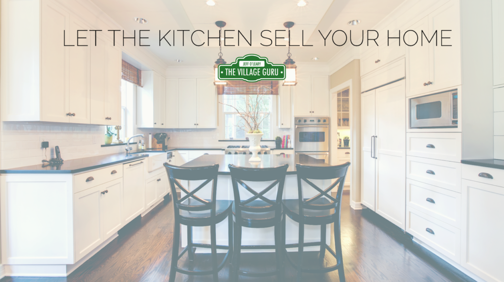
Lately, I’ve been working with a lot of home owners who have older homes and are wanting to update their kitchen in order to sell their home. Whenever I find someone who is willing to update their kitchen, it’s music to my ears, as your kitchen is the most valuable and interesting room to work on.
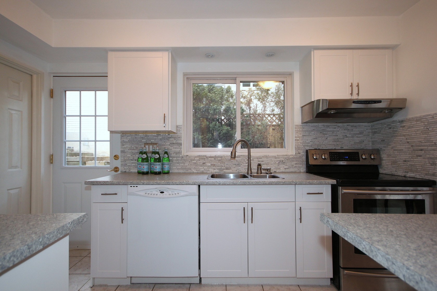
To be fair, I totally understand that there are situations where a home owner just doesn’t have the time, resources or desire to update their kitchen, and that is no problem at all. In that case, we make the best of whatever you have when selling your home. However, if you have a kitchen that looks anything like these pictures AND you want top dollar for your home, I would love to talk to you about a stylish update.

One thing you should know upfront, I’m obsessed with making sure that no kitchen project of mine ends up looking like a Big Box Store Special. It’s not an easy thing to do, since we usually have a crunch timeline of 3-5 weeks to do the work. But I love a good challenge, and the main restriction is that we usually have to work with in-stock items. The goal is to set a classic base of elements that will stand the test of time, and then introduce fresh ideas that are stylish and current. Sorry Home Depot, but the in-stock counter options you sell just don’t make the cut. And frankly, I can get better for CHEAPER.
The reason I can create a stylish, interesting and updated look in less than a month is because you’re hiring all of my past experience, my leg-work for researching suppliers and knowing where the best prices are for everything. I’ve spent hundred of hours sourcing and re-sourcing available items that are priced well and provide the interest and sparkle that every kitchen needs.
Classic Foundation
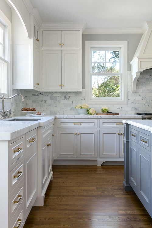
Cabinets are a major part of the cost of a kitchen, and if you have a lot of them, we work with them and make them the best they can be. This might mean painting them out, or re-facing them. If they are in excellent condition, we might even be able to keep them as-is. Decade over decade, the most popular kitchen cabinet colour is white. You serve yourself best to avoid trend colours from past decades and stay as neutral and classic as you can. In certain situations, I also recommend other shades of taupe or grey, depending on the fixed elements of the room we need to work with, like appliances or the floor. The exception to this is having a contrasting island is a great way to break up a long line of cabinets and create a more custom feel.
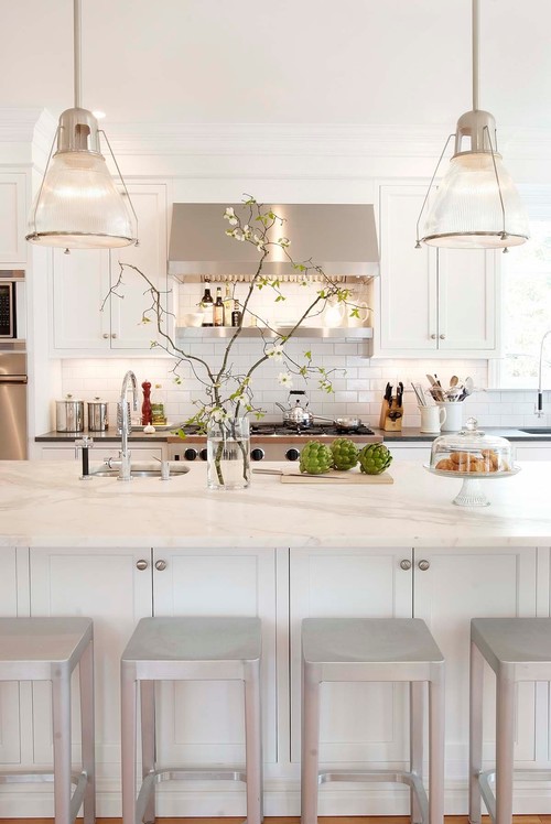
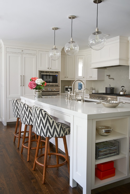
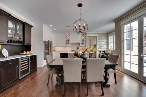
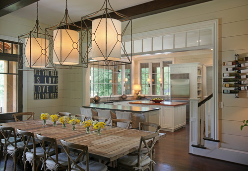
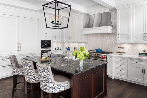
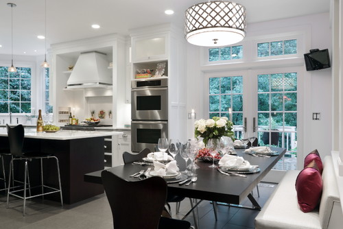
Here are some inspiration pictures of what buyers are looking for:
Flooring, unless it is in poor condition, is usually something I try to work with. Some home owners have no problem removing all of their lower cabinets to install new floors, but for many owners, this idea is far too stressful and uncertain. Sometimes all a floor needs is a good scrub or new grout job to make it look fresh and clean. It also keeps the budget in check so I will try my best to work with a floor whenever possible.
Counters are the trickiest part to the equation because no one wants laminate any more. EVERYONE wants stone. But for staging, often installing stone just doesn’t make sense. I only recommend stone when it’s a high-end home, with good cabinets already in place. But if the cabinets are old, or the cost of the stone can’t be obtained out of the sale price of the home, you’re just losing money. I’ve been using a lot of butcher block lately as a cost-effective alternative. It’s relatively cheap, adds a sense of warmth, looks great with white cabinets, and is very popular right now even in the design world.
If I do recommend laminate, it is with very specific rules:
- There are only about 5 laminate patterns that are even kind of OK, and none of them are brown. That’s why white/grey kitchens work well.
- The counter has to be specially made without the attached back splash; this way it has the same profile and shape of a stone counter.
- And finally, you must install a beautiful tile back splash so that you have an attractive focal point that allows the counter to become just part of the background image.
Speaking of Backsplashes, they are the single most effective upgrade you can do for your kitchen. For the extremely budget-weary, a white or cream subway tile is an eternal classic and always looks good. To make it look more modern we can play with the dimensions of the tile to have a fresh vibe. But otherwise I recommend only one option. Marble. I can get it for $10-$14 a square foot and once you calculate your square footage, you will see that the price difference of the tile isn’t really that much. You are paying for labour more than anything, so I argue get the most beautiful tile you can. This is what makes buyers start to drool.
Light fixtures are the last component of the kitchen that really make the kitchen sing. if you have an eat in table, island or pendant over a peninsula, I insist it must be GORGEOUS. No one ever buys pretty lights but they love having them. Such a small thing makes a remarkable difference and really is the finishing touch to all your hard work. Check out our Ultimate Guide to Cheap and Stylish Lighting.
So if you’re planning to sell your home and know you need to upgrade, make sure you call The Village Guru, so that you don’t have to make all of these little decisions on your own. We can help you plan your project, even design a new layout if required, and help your source all of the products to make sure you have a room that all buyers will love and pay you good money for. Have a question or want to find out more? Fill out the form below.

