Making Your Monochromatic Living Room Pop
People who know me, know that I love colour. I have a green sofa in my living room that I was so excited to buy 2 years ago, and I’m constantly adding new and different accent cushions. Right now I have watercolour printed cushions of little orange birds perched on green bamboo. And everyone who sees my sofa for the first time, still stops and says, “Wow!!!……You have a GREEN sofa!??!?!” As in, Good for you, but I would NEVER do that.
I have come to accept that most people enjoy and prefer a monochromatic pallet; or in other words, many shades of one colour. I have also come to appreciate the beauty of this look, when it is executed properly. Here is where the challenge lies. Every room needs contrast and variation to be interesting. Colour is a very easy way to do this, so if you take colour out of the equation, it is actually more difficult to pull off an interesting monochromatic scheme. And here you thought you were taking the safe, easy road of decorating, didn’t you? However, there’s a good chance you already have some of these elements in your room, so it’s just a matter of adding a few key pieces to get that “designer look”.
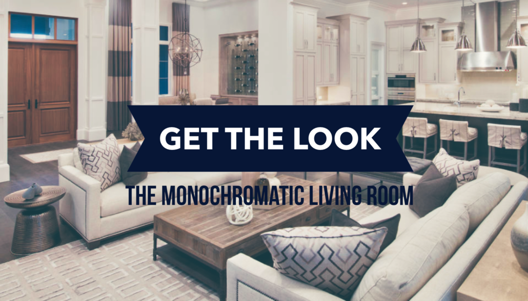
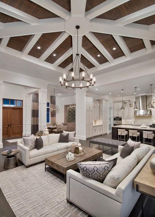
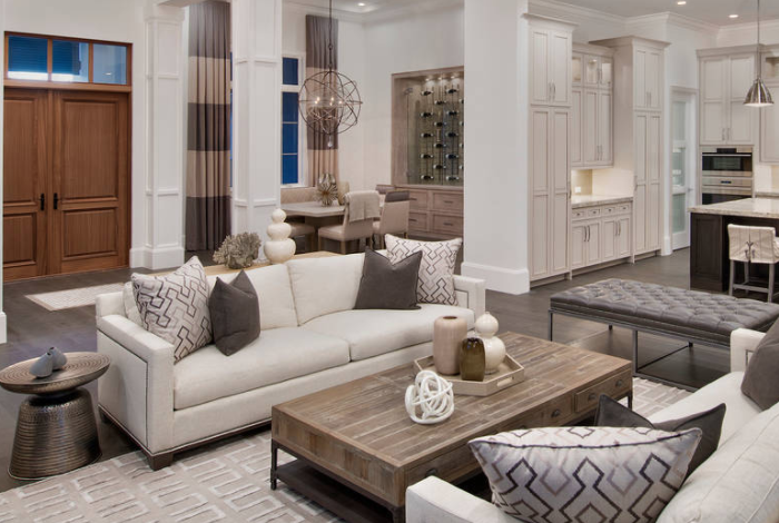
Monochromatic Living Room: Inspiration Photo
Let’s break this room down into it’s key elements:
- Contrast
- Pattern & Texture
- Materials Mix
Monochromatic Living Room Element 1: Contrast
At first glance, the room feels very calm and serene, but this space offers a lot of contrast between light and dark that you might not immediately notice. The floors are a dark walnut brown, which is also repeated in the kitchen island. This contrasts off the cream which is repeated on the walls, trim and kitchen cabinets. Dark wood planks were applied to the ceiling inset, to contrast off the white coffered moulding. This high contrast highlights a wonderful feature and adds interest. If you have high ceilings, this look can also be achieved with paint: because ceilings need only be white if it enhances the design.
Instead of red and green, or blue and orange, this monochromatic look ranges from warm white, all the way along the scale to dark brown. You could also achieve this with charcoal grey, navy or black, depending on what set of neutrals you want to work with.
The key is to balance light and dark as your backdrop. If all of your floors, walls and cabinets are the same shade of colour, the room will fall flat and loose dimension.
Monochromatic Living Room Element 2: Pattern & Texture
With monochromatic schemes, you have to be willing to go WILD on pattern and texture. Since everything in the room is shades of the same colour, each element needs to have a special detail, whether its pattern or texture or both. You cannot “over-do” it; in fact you should be stepping well out of your comfort zone here to ensure you have used enough. Let’s take a closer look at some of the room’s elements:
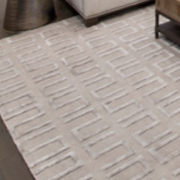
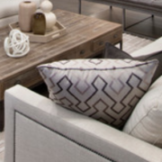
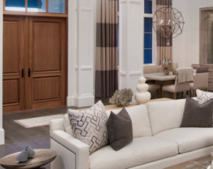
On the windows, bold horizontal stripes were created with 2 tones of solid colour. They pop off the wall colour to highlight the beautiful windows, and add pattern where it was needed. Notice the strong pattern in the rug, accentuated in relief detail, so that regardless of the colour, it’s a rug that holds its weight and adds interest. Looking at the sofa, even the simple linen fabric was dressed up with a nailhead detail, so that there are interesting views from every angle. The pillows offer more contrast and pattern, which is essential to breaking up the plain sofa fabric. These are just a few examples of how to get pattern and texture into your room.
Monochromatic Living Room Element 3: Material Mix
Finally, one of the best things you can do for a monochromatic look is to NOT buy “matching” furniture. This may sound risky, when box stores love to sell you a no-brainer “set”, but with a good plan ahead of time, there’s no need to fear making a wrong move. In the inspiration picture, they have used 2 identical sofas which is excellent for symmetry and repetition, and is a good reason for matching fabric. But if you need a sofa and a chair, it’s far more interesting to choose an accent chair over matching fabric on both.
Other areas to focus on mixing materials are for your woods and metals. Avoid 3 piece coffee sets or using the same light in 3 different size variations. You can step beyond what stores are trying to sell you.
This is a simple, fail-safe strategy:
- Choose 2 shades of wood that aren’t too close in tone and repeat them evenly throughout the room.
- Choose 2 metal finishes you like and repeat them evenly throughout the room.
With these 2 rules, you will get the repetition required to have design flow, but will also have enough variety to ensure your room feels like it was collected artfully over time.
The floors in our inspiration photo are dark walnut, and so that element was repeated on the island for consistency. But then a mid tone wood was introduced on the front door, buffet, chair legs and coffee table, which all blend together and repeat.
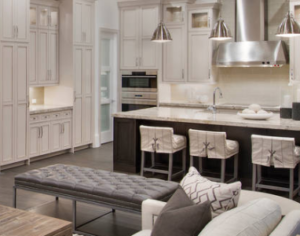
The kitchen pendant lights are silver, which complement the stainless appliances, and then this metal was repeated on the base of the leather bench ottoman. Second, a warm copper brown metal was used for both chandeliers, and on the accent tables.
Spending the time to blend and repeat a small selection of materials will take your look to an all-new level. All it requires is for you to decide ahead of time which elements you want to use in your room to ensure they mix and repeat.
Summary about Monochromatic Living Rooms
It may be quite surprising how many different elements go into a well designed scheme. Step one is to find a picture that inspires you and guides your look. Then, decide the elements you want in your room, and then this will focus your eye when out shopping – whether that be this week or 2 years from now. No matter what your style, having an inspiration and plan will always keep you on the right path. Especially if you are thinking of building a monochromatic scheme, be fearless and be bold – I promise you will thank yourself afterwards.

