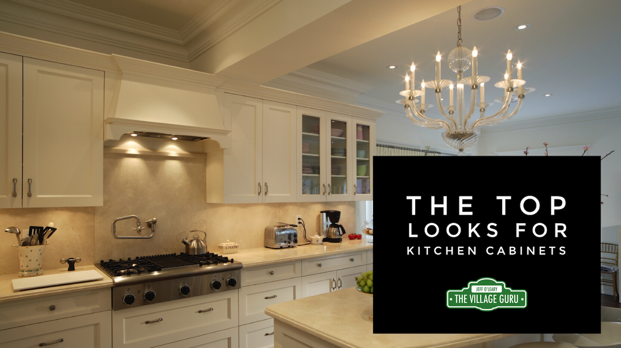
 Keep Your Cabinets for a Stylish and Affordable Update
In most kitchen update situations, whether I’m providing home staging or decor services, I always first try to see if we can work with the existing cabinets. If the layout works well, and the kitchen cabinets are in decent shape, why rip them out? Kitchen cabinets are the largest expense of a kitchen update, so if we can use the current cabinets instead of replacing them, we can use that money towards complimentary finishes such as a new counter and backsplash.
However, sometimes it’s necessary to replace the kitchen cabinets, especially if they’re old or worn, because you don’t want to install a stone counter on old cabinets, that would be money wasted. But quite often, we can work with what you have. These Top Looks for Kitchen Cabinets will set you on the right path to a stylish design that is also very affordable.
Classic Rules for Building a Kitchen Scheme
Every rule is made to be broken, and sometimes it’s essential to get the right look. But for most people, the easiest way to get a classic look is to follow this formula:
- The Floor & Counter are usually the Same Tone & The Cabinets Should Contrast the Two. If you have light cabinets, you should choose a darker floor and counter. If you have dark cabinets, you should focus on light floors and counters.
- The Backsplash and Paint Can be a Transition Between the Cabinets & Counters. They don’t have to match anything, per se, and can introduce the softest of colour if you like. A kitchen looks the biggest when the backsplash and paint are the same colour so that there are no chops from one colour to another.
- Let the Counter be the Focal Point of the Design. Counters and Backsplashes are both difficult to install and change. Many people shy away from too much pattern on the counter, only to go quite bold with the backsplash. This look becomes dated very quickly and puts the emphasis on a tiny 2 foot strip of wall. Keep the backsplash to soft tones and texture, and be a little more brave with your counter.
- Contrast & Balance is Essential to a Good Design. Every purchase for a kitchen is expensive, so it’s quite common for owners to gravitate towards safe & simple all-beige, all-white or all-grey options. But without texture a contrast, you will not end up with a designer look that you are happy with. There’s no point spending any money to end up with something that is bland or unremarkable. Contact me today to learn how to subtly mix texture, tones and pattern to get an elegant look you’ll love for decades.
Exceptions to these rules:
The most common exception to these rules is the ALL WHITE kitchen. White everything, with shades and tones of greys, and often many layers of marble or material that looks like marble. It can be very light, and airy and elegant, but certainly its not for everyone.
The other common exception is for very small kitchens, its a good trick to have a floor that’s very similar in colour to the cabinets. This way, there is no bold dividing line that highlights how tight the footprint is. By choosing to do this, you just need to ensure you balance contrast elsewhere.
Article continued below
Top Looks for Kitchen Cabinets – From Maple to Ash, Painted & White
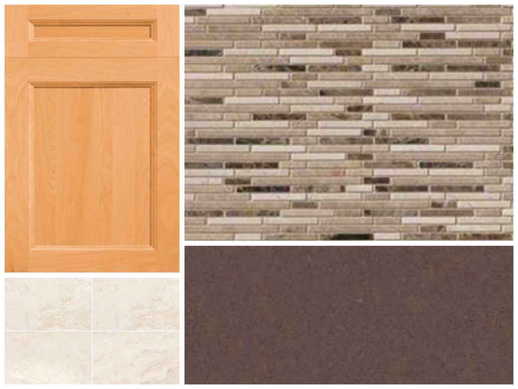
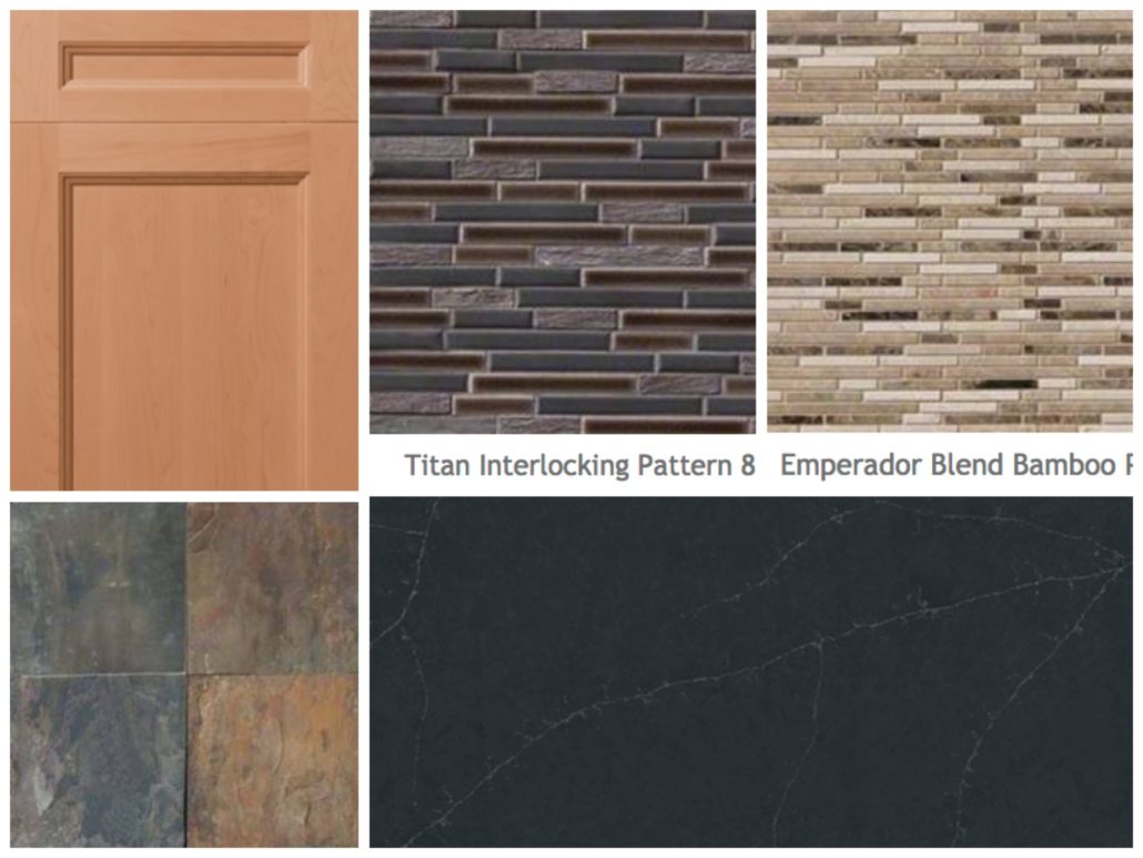
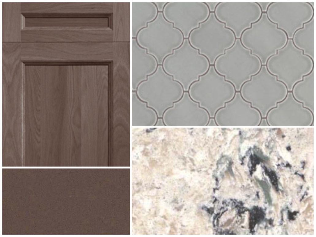
1) Light Wood Maple Cabinets
This colour was all the rage around the year 2000, but right now…..not so popular. But if you have quality wood doors and don’t want to paint them, we can still create classic looks that can look quite beautiful. The key to maximizing the look of light maple is to contrast it with a dark taupe. Black is quite stark and although it’s not “wrong”, it’s a strong look that can date easily. White looks washed out with light maple, so building a look off dark grey-taupe is the best way to compliment the wood for years to come.
OPTION 1:
This cabinet looks best with a dark taupe/brown tile or wood floor that contrasts off the cabinets, avoid white or cream beside this tone of wood. Introduce watery blue-greys and/or greens on the backsplash to break up the tones of brown in the floor, cabinets and counters. Be sure to paint the walls a co-ordinating blue-grey so that the maple cabinets look rich and modern. Stainless steel appliances look best with this look.
OPTION 2:
If you are pro-monochromatic, then stick with the darker tones in the counter but break it up with the texture of a mosaic. Even introducing a dark blue in with the brown adds a touch of colour to the monochromatic scheme. Avoid using the counter material on the backsplash, it’s a look that dates easily and is a lost opportunity for texture. In this look, balance the darker counter and backsplash with a lighter wall paint that is more similar to the floor, but still darker than the cabinets. Choosing a paint colour that’s lighter than the cabinets will make them look bland and washed out.
2) Medium Wood Oak & Beech Cabinets
With a medium tone wood, you can go either light or dark with your floors. If you have a small house, then choosing darker floors will blend with other wood floors in the house. This is ideal to make your floor plan look as large as possible. If you have a large home, then you can branch out and choose lighter floors if you prefer. These cabinets have a strong orange undertone that we want to minimize, so try to stay away from anything blue which will make the cabinet colour stronger.
OPTION 1:
With a medium wood we can break the matching floor and counter rule. With a dark floor, choose a light counter with veins or splashes of the floor colour in it. In this example, there is also a green hue that we pulled onto the backsplash. It’s not a strong green and has a grey base, so you won’t tire of it quicky, and does a good job to add texture and interest. This look is best with a dark taupe or grey-green wall paint, and stainless steel appliances.
OPTION 2:
If you have a light floor, contrast it with a much darker countertop. It can be solid or have shades of taupe-brown and grey. This look lends itself to monochromatic, and so ensure that you choose a backsplash with all of the tones of colour to tie it all together. Ideally stone, to ensure an elegant look, given the simplicity of the colours. If you don’t have a lot of wall space, because there are windows and door openings etc, opt for a dark and dramatic wall colour like the counter. It will look the best and make the cabinets rich. Drama is required for this look, and your room will not look dark if there’s very little wall space anyway. I PROMISE. If you do have a lot of wall space, choose a lighter colour closer to the floor. Avoid choosing a colour that’s similar to the cabinets themselves, as that will make them blend in and be forgotten.
OPTION 3:
If you have a slate floors, which is very common with a beech cabinet, you already have a lot of colour happening in your floor. Focus on neutralizing it with a dark grey or black counter – a soapstone or a quartz that looks like soapstone with subtle veining would be ideal. Then find a backsplash that subtly plays to the colours in the floor. Black appliances look great with this look, since stainless can feel a bit too cold. But there’s no getting away from it, this is a darker look and works best in a room that gets lots of south or west facing sun. If you have this combination and your kitchen is dark and dull, I would recommend painting out your cabinets a soft colour to get a brighter feeling kitchen.
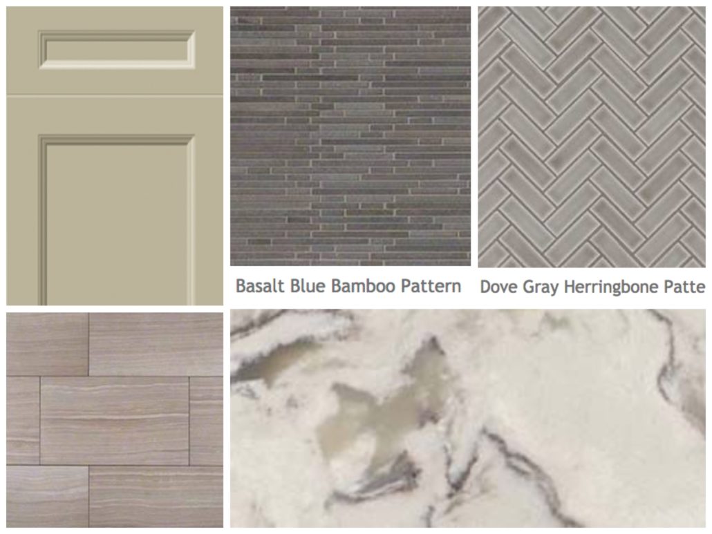
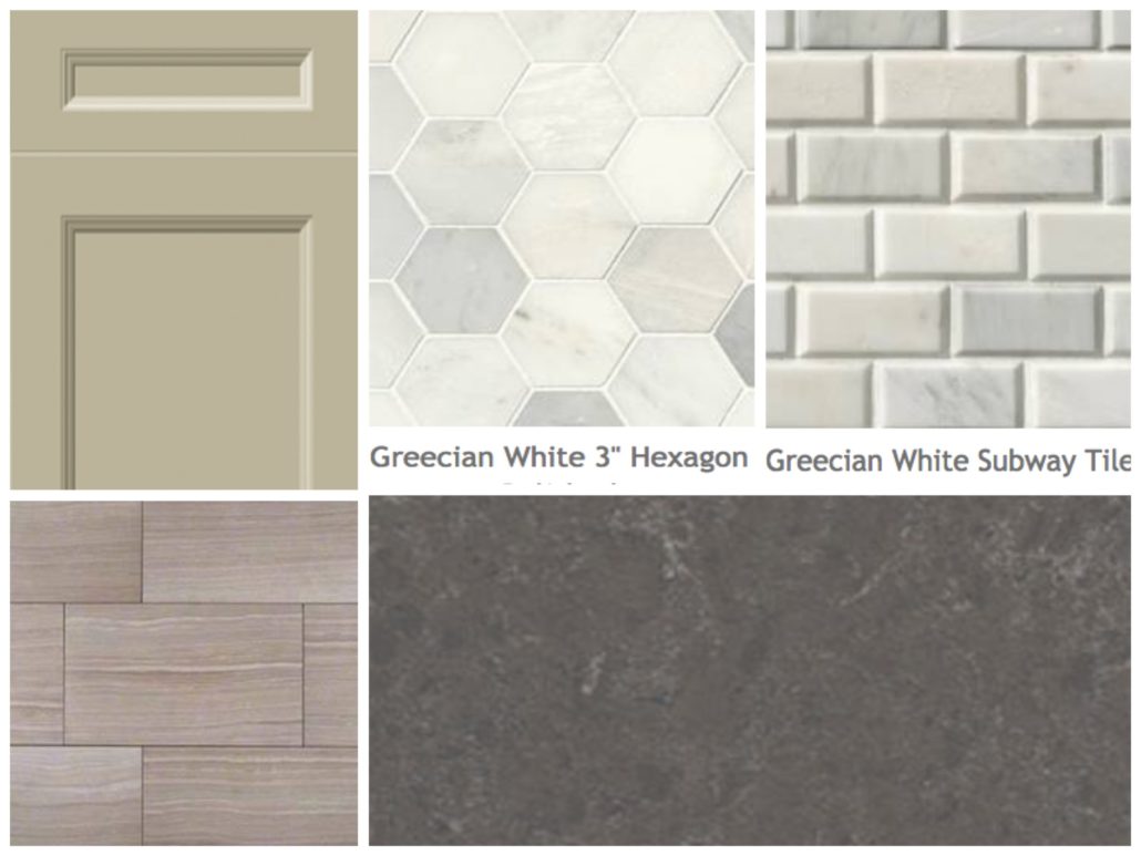
3) Painted Cabinets
Speaking of painted cabinets, I love all shades of taupe, blue and green cabinets. If you are starting from scratch, its great to mix a coloured island with white or wood cabinets. For this article, the colour that I see the most from decades gone by is pickled pink and green. I’m sorry, pickled pink MUST be painted out. it’s just a bad mistake that I think we should all forget about as quickly as possible. But if you have some fine looking sage cabinets, they can actually be used in a modern way.
OPTION 1:
With both options, this look is best with a wood floor, or a mid tone tile that mimics the look of wood, travertine or limestone. There should be no yellow-brown tones to any of the finishes, they should firmly stay in the grey-brown or taupe family. The first option has the cream counter with veins of grey and green. The greens don’t have to “match”, they just have blend in tone. For the backsplash, use the grey vein colour, but it too can have a hint or mix of green to it. Ensuring a wide range of tones from cream to taupe to dark grey and green will provide the interest necessary. This look works best with stainless appliances or concealed appliances, because you don’t want them distracting from the mix of coloured finishes.
OPTION 2:
This option is for those who want a dark counter. Try to stay with dark grey-taupe, and not a cold charcoal or black. This look just begs for a marble backsplash, as there are so many creamy options with shades of blue-grey, green and taupe. It is the luxury touch that will make everyone comment every time they see your kitchen. If your budget is tight, you can have a laminate counter custom cut without the backsplash to mimic the shape of a stone counter. Mixed with a marble backsplash, you wont feel like you sacrificed at all. And down the road, it will be easy to upgrade to a dark taupe quartz or granite without ruining your lovely marble backsplash.
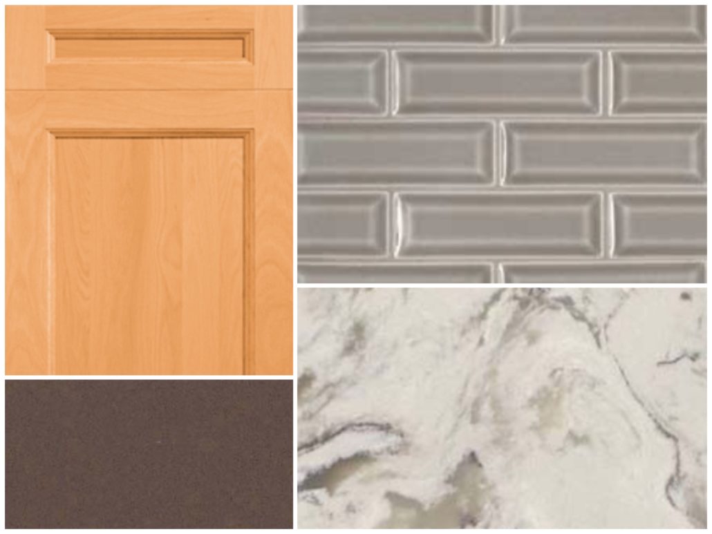
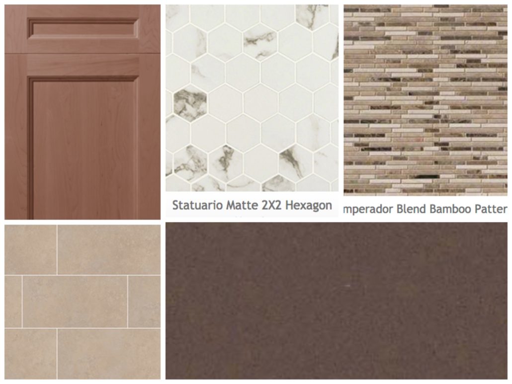
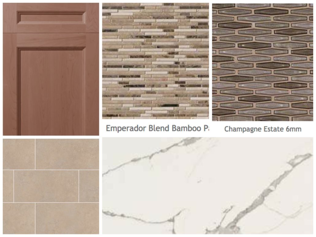
4) Dark Cherry Cabinets
What can I say about red-cherry cabinets. I really don’t like them. I will beg of you to paint them. They are the most restrictive colour because of their red undertone, and its extremely difficult to achieve a bright or airy look. This is also why, as durable and high quality exotic wood floors are, I don’t choose them because they have so much red and orange tone to them. But, here is the one and only look that can make cherry cabinets work; in my opinion.
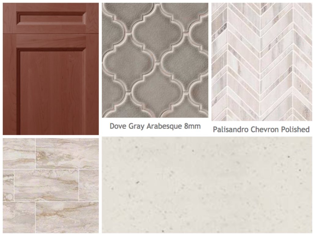
THE ONLY OPTION:
These cabinets are so dark, it’s imperative to balance them off with light finishes, BUT, they can’t look washed out. Often you see this wood with hunter green granite and dark floors, but this look is best left to Irish pubs and golf club houses. Here, we want to find a light tile floor that definitely has warm tones mixed in. In the example there is a light warm brown and small wafts of green as well. It’s ok for this floor to have a strong pattern, to balance the strength of the cabinets. If you prefer, you can swap the counter and floor so that the counter has the pattern and the floor is quiet. But one of them should have some definite pattern. For the backsplash, you can choose a grey-green or a marble with tones of cream and grey and green. Let’s leave dark hunter green & forest green to the past, and focus on a soft, grey-toned green so that the overall look is lighter and more reflective. Ideally, most or all of the appliances are concealed, but stainless would be the practical runner-up.
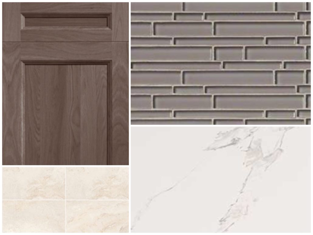
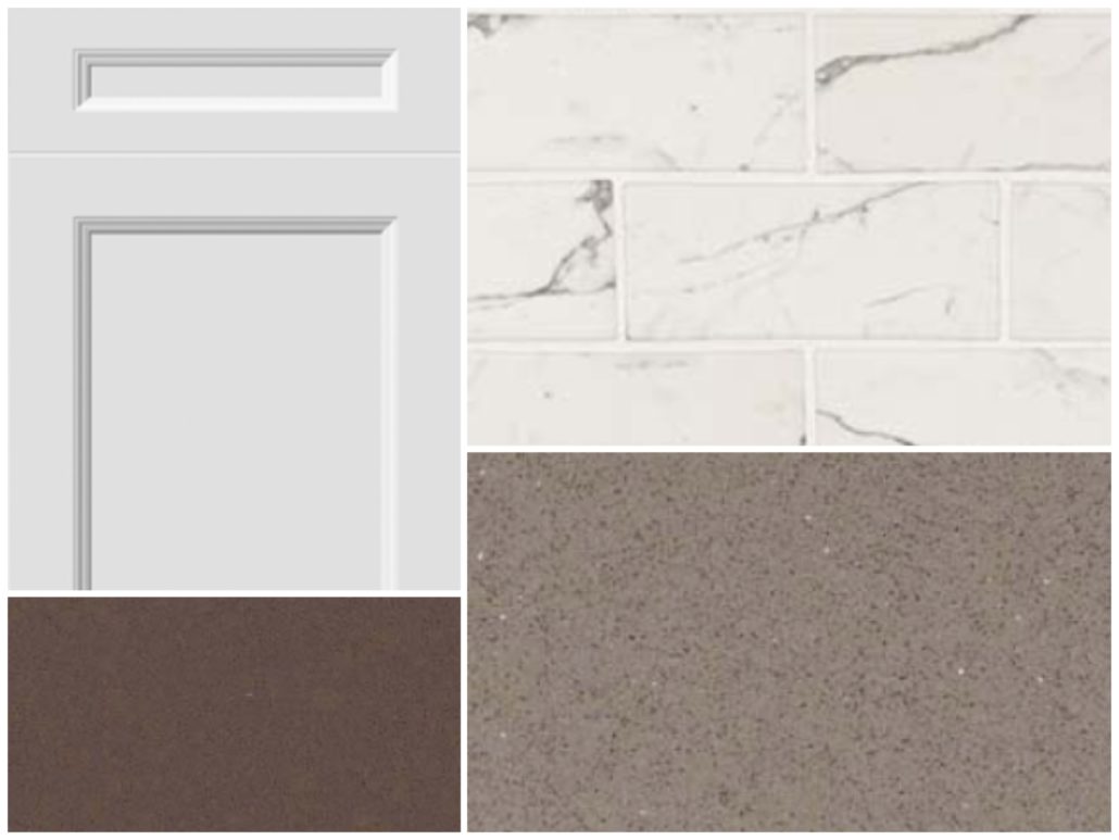
5) Medium & Dark Ash Cabinets
This includes any maple, cherry or oak wood door that has a grey-ash undertone. The cabinet definitely looks brown, with no orange, yellow or red popping through. This is a classic neutral colour that is neither one extreme nor the other, so its well worth working with these cabinets if they are in good condition.
MEDIUM ASH OPTION 1:
Even though this is a mid tone, the sheer colour of brown cabinets can feel heavy and dark very quickly. So in both options, a slightly lighter brown tone floors is best. You can then choose if you want light or dark counters to either balance or contrast the floor. With this option, we chose dark counters, which will blend in with the cabinets. This look requires a large, bright space, so that there’s lots of natural light to bounce off the surfaces. For more balance, choose a marble mosaic called Statuario, its a creamy white with the most gorgeous brown veining. Some Calacutta marbles will also work, which has a gold-brown vein. It will add texture and beauty without being too bold. For appliances, there’s a new SLATE COLOUR that has a very definite taupe tone, which would look wonderful with this look. Appliances should never stand out, as you want the focus to be the stones and your wood.
MEDIUM ASH OPTION 2:
This is my preferred option, with light counters that have a grey or brown veining like marble. This will reflect a lot of light and you can get these patterns in quartz or even high density porcelain slabs if you know your family is not “marble friendly“. Pair it with a textured backsplash – you can stay light as in the first example or go darker if you prefer. As well all backsplash options, try to get a lot of texture but keep the colour calm with minimal contrast or pattern.
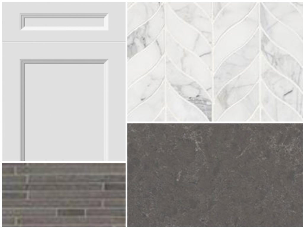
DARK ASH CABINET – TOO DARK??
I adore dark ash cabinets. They feel like rich wood furniture which is ideal in my books. Too many people worry about dark colours and how it will make their home look. But these are the same people who leave all of their lights off and blinds closed all the time! That will make your home feel far darker than any cabinet can. Now for arguments sake, if you have NO windows near your kitchen, or it’s a long tight galley kitchen, these cabinets can feel heavy and imposing. But if you do have a relatively open L or U shape layout, there’s no need to fear the dark cabinet. Ensure you DO have enough lighting, which includes a central light fixture over your work zone, island/peninsula and table. Additional lighting includes pot lights, under-cabinet lights or valance lights.
DARK ASH OPTION 1:
This first option is the classic rule-abiding look of light floors and light counters. You can choose 1 to have a strong pattern, and the other to be a quiet design; usually the counter is the better options to be bold. Making floors the bold focal point just demands that people look down. I would much rather people look up to counter height. Pair it with a watery blue or green for the slightest touch of classic colour without being too bold. The paint can then be a taupe, or a blue or green to blend the backsplash, depending on how much colour you want in the room.
DARK ASH OPTION 2:
If you have dark floors in good shape, no need to remove. Especially if you have a small kitchen, a floor of similar tone to your cabinets actaully helps to expand the space by avoiding a contrast line at the floor between dark and light. Bring the attention up to the counter with strong quartz or granite, and don’t be afraid of colour and pattern. Many stones have hues of greyed greens, blues, taupes and grey. They really are a work of art so if you find one that makes you smile, and you enjoy looking at it, be brave and choose it. take one of the colours and put it in the backsplash, again focusing on texture so that it compliments the counter and doesn’t fight it. With these dark woods, a little colour goes a long way to create necessary interest.
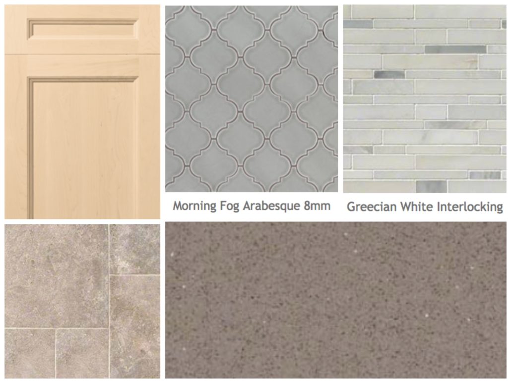
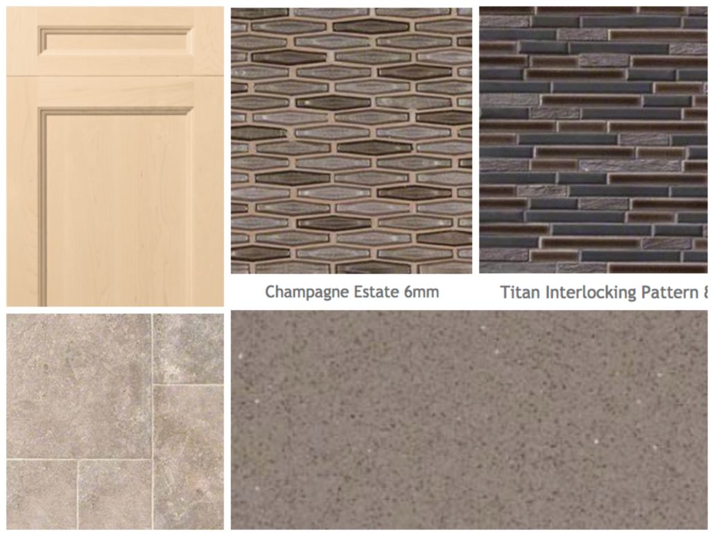
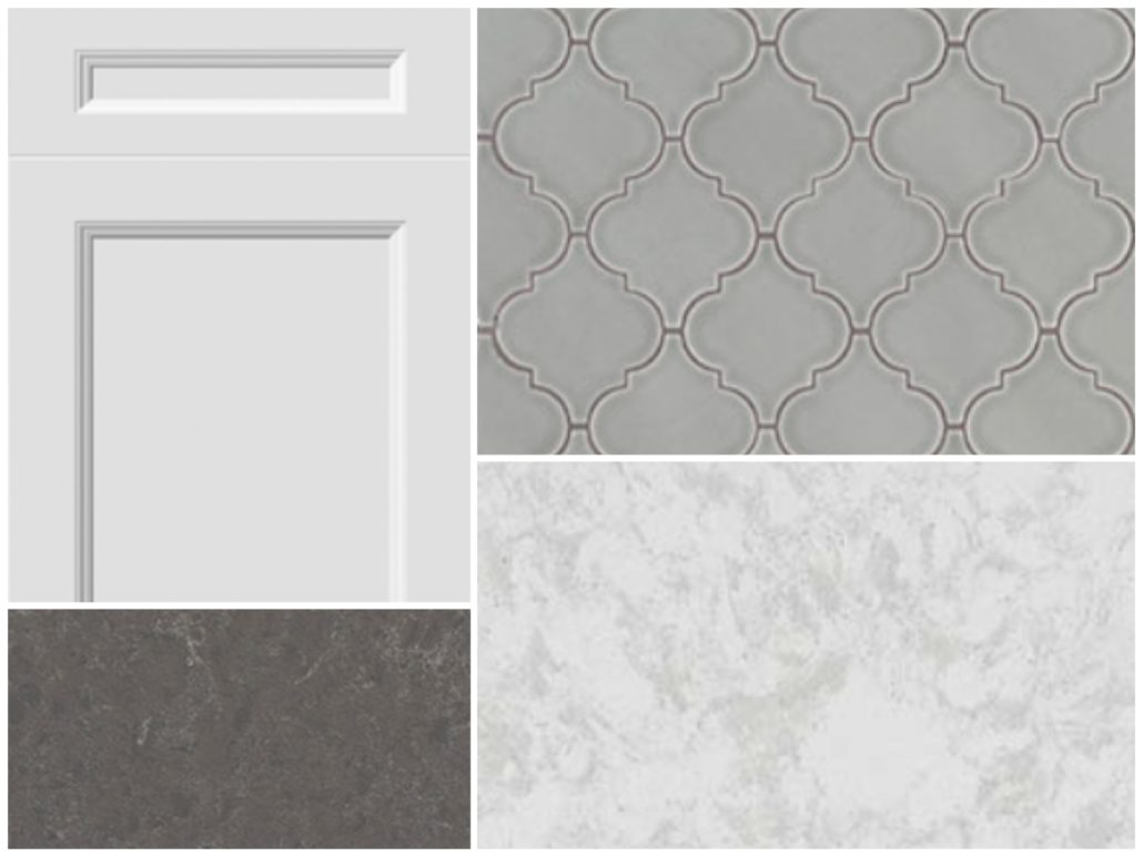
6) Cream & White Cabinets
Here is where the world is your oyster. People love white and cream because of all the options that work with it. You can go high contrast with grey or black, mix in colours or create cloudy layers of white on white on white. In reality, these endless options are actually more stressful, because it’s hard to narrow down. With most other cabinets, there’s only a small set of combinations that work. With white, it takes a lot more planning and deciding.
If you have cream cabinets, work with them. Many cream cabinets have the traditional oil rubbed nooks and crannies, but if your cabinets are high quality and you’re not quite ready to put a brush over them, we can work with them for now and in the future. These cabinets tend to be more traditional looking, and my first recommendation is to simplify their look as much as you can, by bringing in transitional material and stay away from anything traditional. This will balance the look and make the kitchen feel more current for a longer period of time.
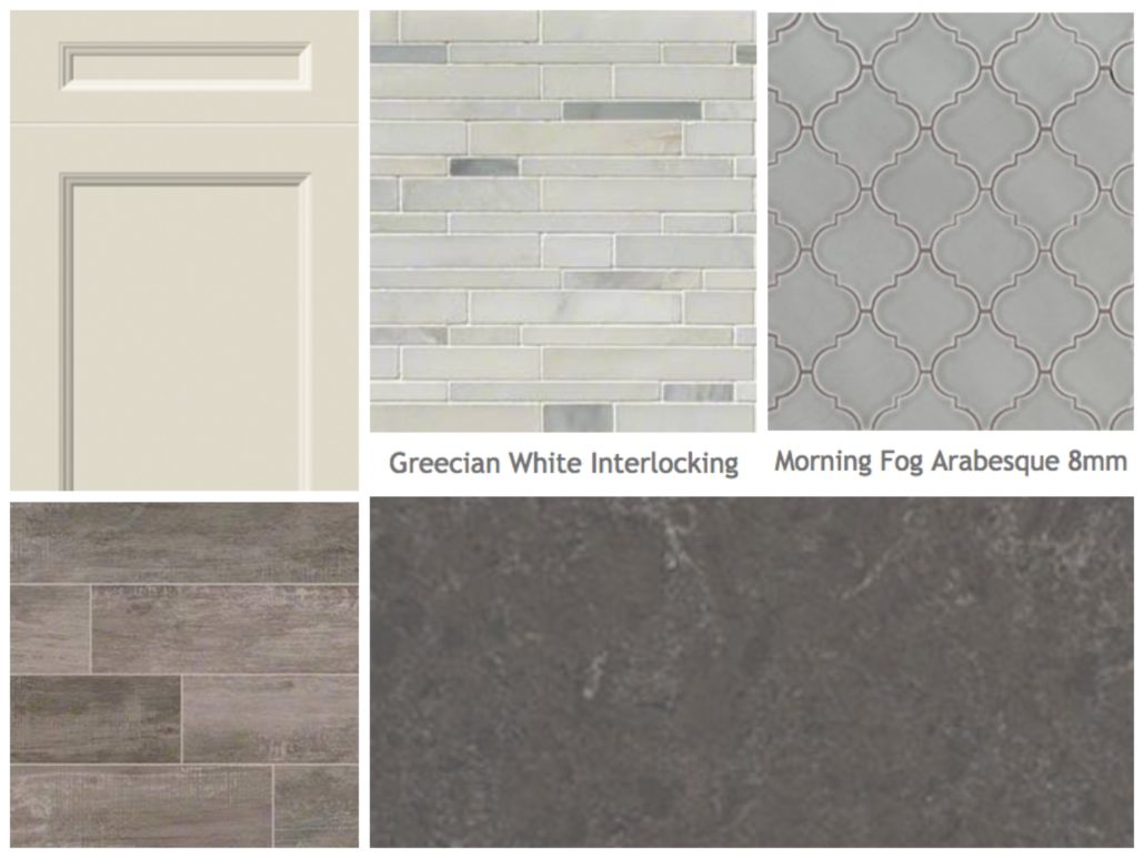
CREAM OPTION #1:
This look is idea with a mid-dark tone wood or tile plank that looks like wood. Ideally nothing too shiny or pristine as that’s the traditional direction. Choose a matte finish with a little aged look to it. Pair this with a very dark taupe-grey counter. All of the quartz companies have come out with a suede finish, which does not have that high polish sheen, but more of a weathered, leather look. **I m still doing research about durability and warranty on quartz with suede finish. Thought beautiful, you want to ensure it will perform the way you expect and need it to. There are also porcelain slab counters with a matte finish, available from a variety of manufacturers, which claim to have the same high durability as polished finish. Use real marble on the backsplash – this Grecian white is all shades of creams, warm white and grey-blues. Try to avoid stark, ice-white marble to ensure your look is elegant and consistently warm.
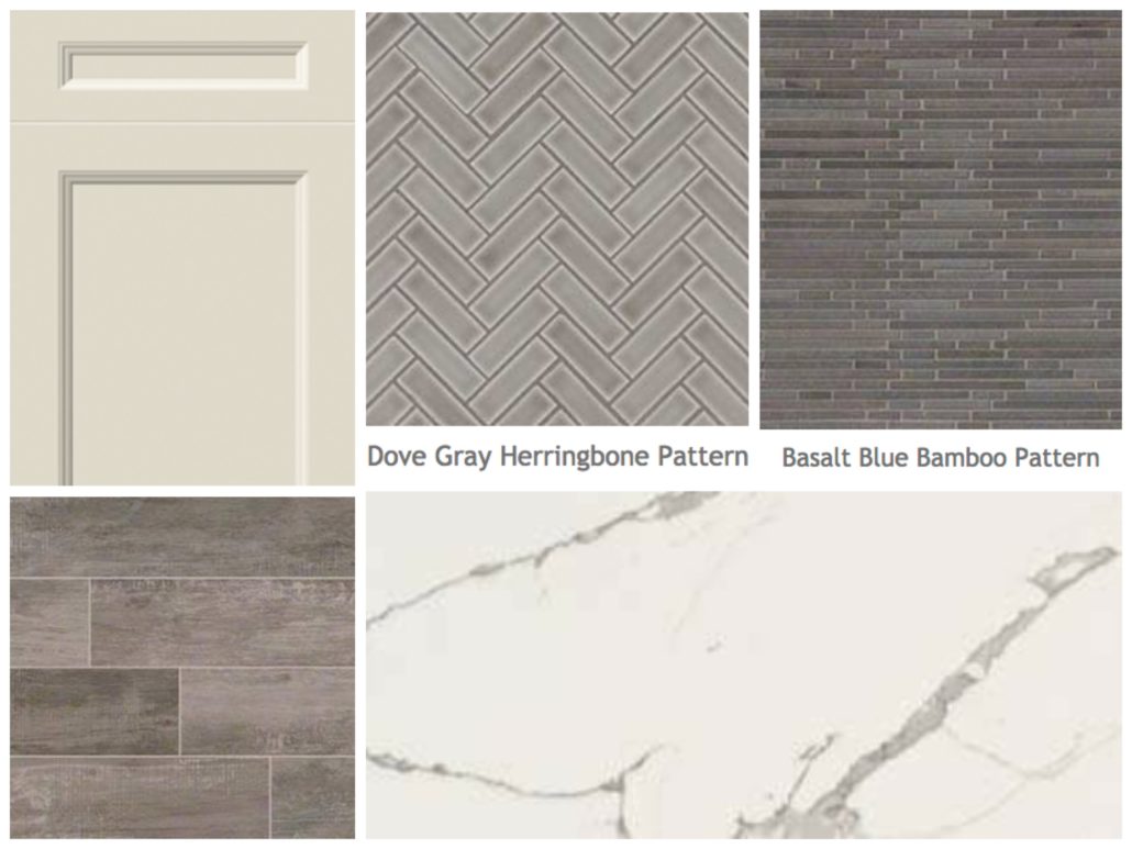
CREAM OPTION #2:
You will probably guess that this look is one of my favourites. Yes, anywhere I can inject marble, or quartz and porcelain that looks like marble, I’m game. I love a dark floor and a light counter, which definitely breaks the rules. I see the floor as long wood planks, the warm white counter with taupe-grey veins, and the grey-blue backsplash either in a glass herringbone or rough cut stacked stone. All of this texture combined with light and dark will add tons of interest without anything being overpowering. Just keep saying to yourself, texture, texture, texture. That is the key to a great end result.
White Cabinets:
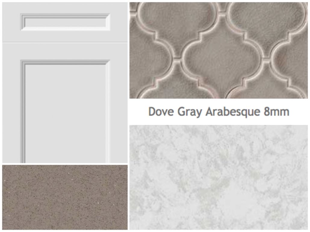
WHITE OPTION #1:
You can either mix white with warm tones or cool tones, and you can take this cue from any other fixed elements in your home, because consistency of tones and material makes for the best look. So if you have brown floors, and a lot of light-medium honey wood in the house, a brown hue is likely the best choice. In option 1, you have a mid tone taupe or brown floor. To keep things light and airy, we contrast this with a cloudy, mottled quartz with hues of grey-blue, green or taupe. It provides a little movement and pattern but nothing overwhelming. Then use a taupe-green backsplash for a bit of colour. This look works best when you have lots of exposed wall – perhaps on the range wall or by the sink. Instead of this tile creating a 18″ stripe under a lot of cabinets, this look should feel more like a tile wallpaper, where it covers at least some portion of the wall up to the ceiling. That is why the tile should have lots of texture and be a cool calm colour. Then match the wall paint to the tile colour for a seamless flow. Your white cabinets will POP off the colour of the walls and tile.
WHITE OPTION #2:
This look is like the first but with a more monochromatic goal. The floor can be a wood floor, or a darker porcelain, and the counter a very simple and elegant quartz. The WOW factor is a marble backspalsh, and the more space you have to use this tile, the better. You want a marble with veins of gold and brown, and there might be a touch of blue pop in as well, that’s ok. Since the floor and counter is so simple and quiet, there is no such thing as “too bold” for the marble pattern, so long as it stays within the brown-taupe colour family. If you want drama and have very little wall space, you can paint the walls a dark ash-brown like Benjamin Moore Barnwood. If you have a lot of wall to cover, then you can choose a white like the cabinet and make sure the counter and backsplash are the strong focal point.
WHITE OPTION #3:
Here we are moving to the cooler tones with grey and charcoal. I am still not a fan of pure black with white, as it was a bit butchered in decades past, and all I see is 1980 when I see a pure black and white kitchen. The one exception to this that’s growing on me is a black soapstone counter, because its still not a pure black. The floor could be a grey wood, a wood-look tile, or a porcelain. Try to stay away from floor tiles with a strong linear pattern, as they will get tiresome and dated quickly. Try to find a mottled look porcelain with colours you like. Then, take this mottled look to the counter but flip the colour. The base is the cream-white, with a variety of shades speckled in. Then go back to a neutral colour tile for the backsplash with lots of pattern. Get a grout that matches the colour of the floor and blends with the shades in the counter. This will make the pattern stand out without hard white lines.
WHITE OPTION #4:
This is another one of my favourite looks, because I do love a warm grey. This entire look was build around the gorgeous marble backsplash, and there is nothing wrong with reverse-engineering your design. You really should have something you love that acts as the launch pad for all other decisions. It could be a stunning counter, backsplash, or even a handle or faucet. If you find something you love, especially if you have white cabinets, we can absolutely build your new look around it. With all of the different shades of grey in the mosaic marble, there’s no need to exact match anything, we just need to find material that blends. The counter and floor are shades and variations of warm grey. This will prevent the kitchen from feeling ice cold. Try to avoid silver or nickel in this look for a designer feel. Appliances can be concealed or white, but I would use a stunning black range as a bold focal point. the sink and faucet I would also choose black for it to blend in with the counter and completely avoid stainless steel. Then with with door handles, you could either choose flat black or antique gold – nothing to brassy.
Summary
There are so many ways to create a classic look with any cabinet colour, by using these top looks for kitchen cabinets. Every decision for the kitchen is an expensive one, so it serves you will to choose material that is timeless, yet interesting. Textured, but not bold. That has colour, but not strong. Most kitchen sit on the extremes of bold but dates quickly, or safe and boring. And neither of these options will please you in the long run. Whether you are planning to update your kitchen to sell, or want you update your current cabinets for a fresh look, contact me to help you put together a timeless, elegant look that will make you happy for many years to come.
PS: You might have noticed that any accent colour was in the blue and green family. This was not random or accidental, but very deliberate. ALL woods have a yellow/red/orange undertone. So the best way to make wood look rich is to use complimentary colours: blue and green. As long as there’s a lot of grey in the tone, these are just-barely-there shades that still act as neutrals but make any wood look its best. If you just adore bold reds, yellows, oranges or purples, use these colours in contained rooms with a door and little woodwork – bedroom, laundry room, mudroom, etc. These colours camouflage wood and are hard on the eyes for a majority of people. The way to add the most value to your home is to create bright, complimentary and rich spaces.