A Kitchen Remodel
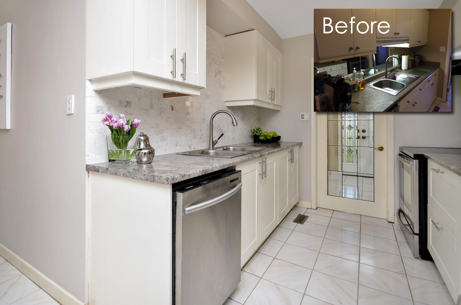
More often than not, you will hear us talk about spit and polish updates. Don’t gut your kitchen, work with what you have and make it the best it can be. But then there’s times when you have a magical combination of eager client and worn out kitchen. Again, our priority is never to induce more stress or disruption that you can bear, and even if your kitchen is looking a little worse for wear, if you say that you just can’t handle the mess of renovation, that’s where we say, No Problem! And the conversation ends there. In this case, our client was chomping at the bit to renovate her well-used kitchen and wanted us to help make the design plan and steer the decisions. I won’t lie, I ADORE a good Kitchen Remodel, because it can make such a dramatic difference to a home and anytime I can install marble, i’m all over it.
Why this Kitchen Remodel Would Bring a Good Return on Investment
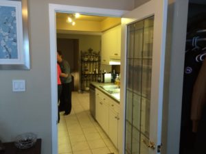
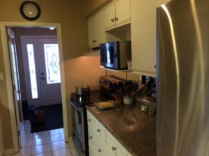
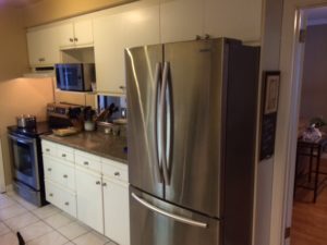
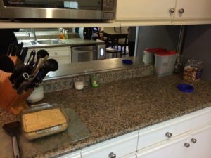
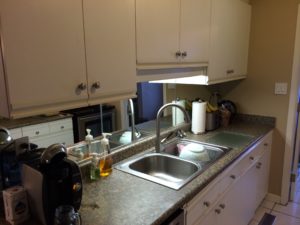
Gut jobs are risky because you have to tightly watch your budget, and prices can soar up quickly. You will see in the staging report further below, that the client and I both wanted to add wood or tile throughout the kitchen and if wood, to re-stain all the wood floor to a more contemporary walnut. After some research, our client quickly decided that it was not in her budget to do so. But her floors were neutral enough that we decided we could work with them and draw attention elsewhere, so that the floors became a non-issue. Since we could focus on just new cabinets and finishes, we knew we could keep the budget in a good place. The other consideration is that the kitchen was small and it was a modest family home. We knew that using IKEA cabinets would be perfectly acceptable to the new buyer. If this was an executive home, the kitchen would have been much larger and there would have been an expectation of a custom kitchen. So as you can see, we weigh a lot of factors in deciding the best course of action to ensure we meet the expectations of buyers and keep the budget appropriate to the home and within reason for the client. Here are a few pictures of the kitchen before, and you can see, the cabinets had been painted one too many times, the doors no longer closed properly and all of the finishes were dated and worn.
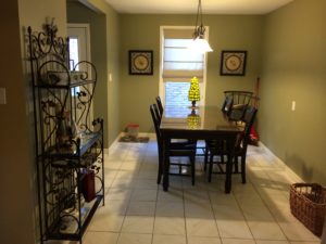
Before Photos
The Plan
This is one of the most enjoyable parts of the process to me. It allows me to be creative, and make the best use of the space. I am a strict believer in function first, then style. This is why it drives me nuts when I see listings where they tried to “pretty up” something that was functionally wrong, like putting granite on poorly configured, old cabinets. (#1 pet peeve). As I am not easily offended, I always give a safe predictable option, and also a 2nd option that might push your comfort zone a little, but is absolutely fabulous. Most home owners turn me down on the fabulous option and that’s ok, but I love challenging myself and exploring all possibilities. I gave the client both options and she chose the safer and cheaper option, which is 100% ok. Click the link below to see the 2 options.
Kitchen Plan A and B
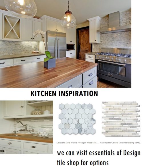
The Inspiration for The Look
I think its really important to give the client a view of what the end product will look like before we even start. My mind’s eye is always on overdrive and I can see what your house will look like, but most people need something more concrete. This is especially true for something as involved as a kitchen remodel. Since we were working to downplay the client’s white-ish tiles, adding white cabinets would minimize any contrast along the base of the cabinets and floors: allowing the floors to blend away and make the narrow room feel as wide as possible. Then, we wanted to add a contrasting counter, to bring the eye up away from the floors. Finally, we wanted a beautiful backsplash and new lighting to add fixed focal points that felt luxurious but were economical too.
Here are the links to our costing at IKEA if you want to know general prices. You need to subtract out the cost of the dishwasher from list since the client already had one, but we used it as a placeholder in the design.
Kitchen Plan Outline 3D Plan View
Putting the Cart Before the Horse
A word to the wise, give yourself LOTS of time to do the work, like a few months before you want to list your home. This kitchen remodel actually HAD to happen because during the time I gave her my plans and when I was waiting to hear what she wanted to do, she got into a “demo state of mind” and ripped out her kitchen herself, and didn’t tell us she was doing it. So when she did call, shock was an understatement. So off to IKEA we go to get cabinets ASAP. Upon arrival to IKEA, as is very common, half of the cabinets we needed were out of stock. Cue Panic. She was determined to get her house listed in 2 weeks, but sometimes that’s just not possible. She had no real reason why she needed it listed so quickly but this deadline was causing her a lot of stress. This is the kind of stress that you can avoid with a lot more planning and setting a reasonable timeline.
Another issue that came to light is that when they had tiled the floor at some point in the past, they had tiled AROUND the old cabinets. This is a major no-no. If you want to replace your floor and you have very old cabinets, wait until you can budget to do the whole project together. So when these old non-standard cabinets came out, they left behind a major hole in the floor where new standard cabinets had a hard time filling. With over 9″ of filler pieces (no combination of standard cabinets could shrink the gap any further) we got the job done, and no one could tell. But it also meant that we couldn’t use the IKEA counter we wanted to use without having a seam, and I don’t recommend seams in laminate counters. We had to go to a counter manufacturer to have counters fabricated, which was a great price, but this also added to the delay in time.
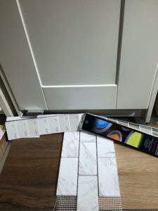
ABOVE: These are the IKEA Cabinets with the marble backsplash tile and the darker counter that we wanted to use from IKEA. We chose Benjamin Moore Edgecomb Gray as the paint colour. You will see from the after pictures below, that we couldn’t get a decent wood look laminate from the counter supplier, so we switched gears with a more mottled stone look. The key was to have it installed without the kickback, it was flat just like a real stone would be.
Hiring the Right People
We always budget for labour, as these are not DIY activities for most people. We connected our clients with a contractor who could do the minor electrical work, patch the drywall, paint, and install the cabinets, counters and tile. Without them, this project would have crashed and burned. So again, the lesson is to take your time, have the plan, hire the right people and don’t rush. This is the best way to ensure you make all the right decisions and avoid unnecessary stress. Here are some pictures I was able to snap of our hard working contractors making progress:
The Results
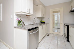
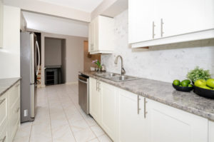
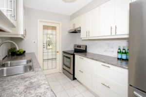
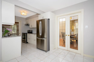
So in the end, was the Kitchen Remodel worth it? Absolutely. The house sold for way over asking price, which it would not have done with the old kitchen. We also brought on props and accessories to revamp the other rooms in the home so that the presentation was at its best from top to bottom. We work with our clients for weeks and sometimes months before the home gets listed on the market for sale. This extra level of service and advice goes a long way to make sure the final product is the best it can be, and having that extra level of support is good for your mental well being as well. The most important time of a listings is truly BEFORE the home gets listed, and we invest heavily in this time. This is how we get the best results for our clients.
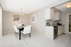
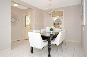
The client cut down their bar height table and painted the legs black, and they installed our recommended chandelier. We brought in the white chairs, the accessories and artwork. The kitchen was a showcase of marble, as almost every buyer who walked through the home commented on how much they loved it. I cannot stress enough how magical a marble backsplash can be – it’s like a buyer magnet.
Other Photos
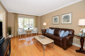
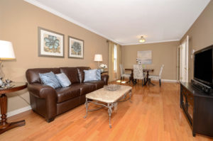
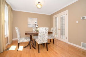
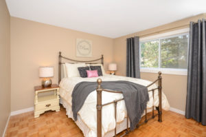
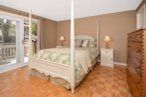
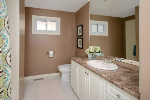
Here are some pictures from the rest of the house, the client bought some new chairs, and we brought in a dining table, other small furniture, artwork and accessories. See our portfolio for more before and after examples.

