SUMMARY
Our clients had lived in their home for decades, and now that they were retired empty-nesters, the desire to move back near family in Quebec was motivating them to sell. They had upkept their home throughout the years, but there was one big project they wanted to do before they listed their home for sale.
OUR SERVICES
Most agents spend an incredible amount of time generating new “leads”; by asking, asking, asking for referrals, door knocking, cold calls…..all terrible jobs. Personally, I despise the hustle for leads; my wonderful clients often find ME, because they see that The Village Guru offers the service and experience they are looking for. Our clients at Formentera were a great example of this.
The husband was a diligent researcher and he told me that he had been watching activity in his area and reviewing websites for some time. He had been evaluating my website and signed up for my seller’s program. He was set up to receive listings similar to his home, and part of the program is to receive a weekly email about the selling process. Within 2 weeks he called me to have me over for an interview.
He said he was impressed with my work and he believed I could do the job well, but what impressed him the most is that I didn’t harass him. I didn’t try to call him straight way asking for business or pressuring him to sell. Those tactics were offensive to him and he was so pleased that I showed him the respect he wanted. This is the kind of working relationship I love to have, where we both respect each other and value each other’s time and knowledge.
The positive, respectful relationship was more than enough to make me incredibly excited to work with this couple, but then it got even better. I was also chosen because they liked the renovation work our team had done on previous listings, and they wanted us to help renovate their kitchen before listing the home for sale. When Stephanie heard the news, she was excited to get started right away.
“Small spaces are often more complicated to design, especially when its a kitchen.” Stephanie explains, “I love being challenged in new ways with each project. They are going to wish they had done this kitchen project years ago!”
Stephanie met with our clients and set a plan that would take 5 weeks to complete. She explained that she would be there for them to plan, design, source and help problem solve the whole way though. The owners are always in charge of the project, but she would be their right-hand man to get them through the inevitable hurdles of a renovation. We also connected them with our professional contractor, to get the project done on time, and on budget.
The Plan
Even thought it wasn’t a huge house, the scope of the project was significant. Through market evaluation, there was room to max out the selling price with a high impact, yet affordable kitchen renovation. The total budget, including paint for the main floor was $12,000. They were going to keep the floor and appliances but everything else was to be replaced and upgraded. For the main floor, new paint colours were necessary and we needed a full staging plan for the entire house.
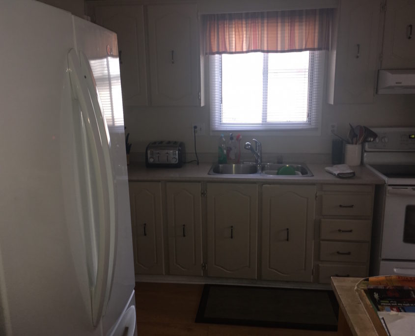
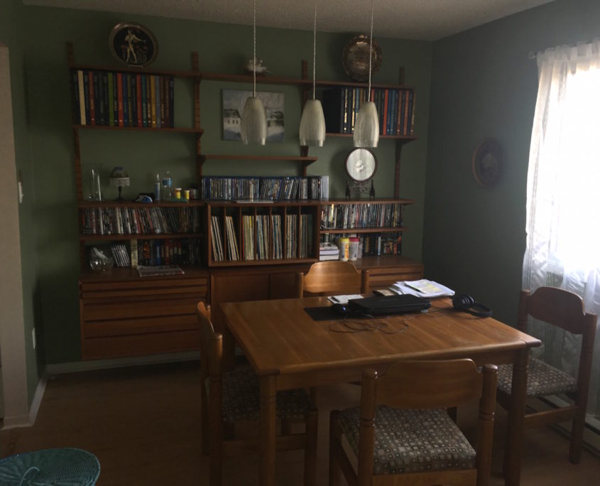
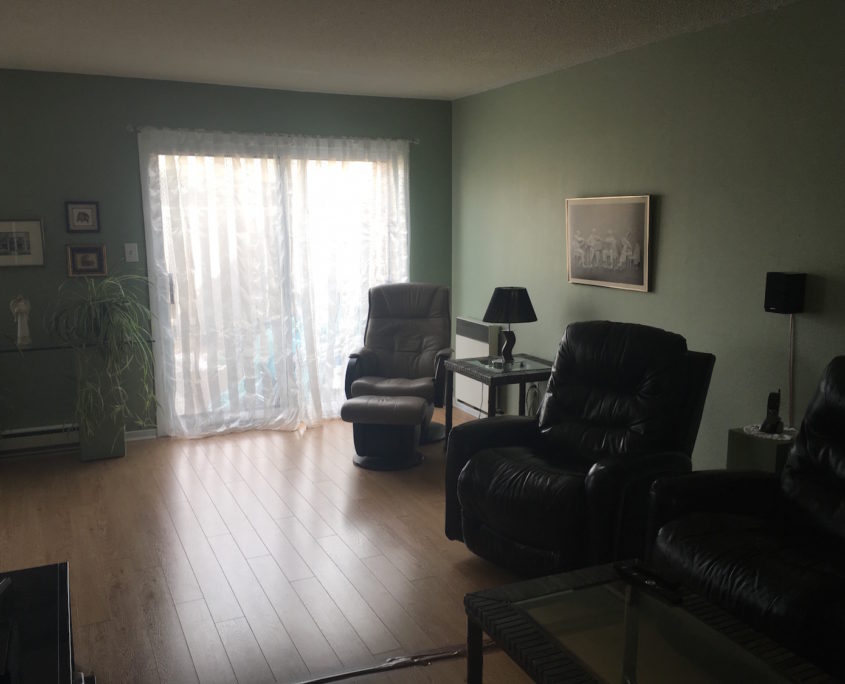
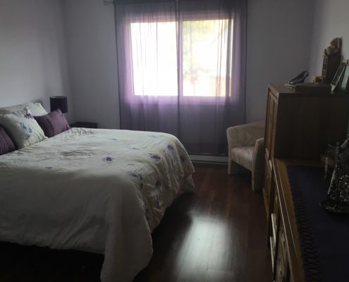
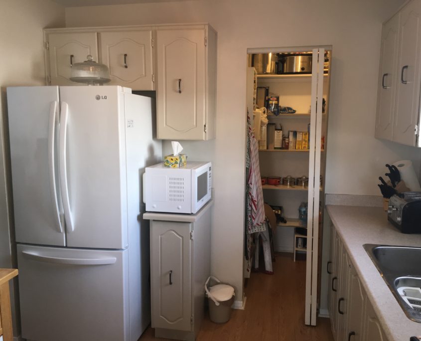
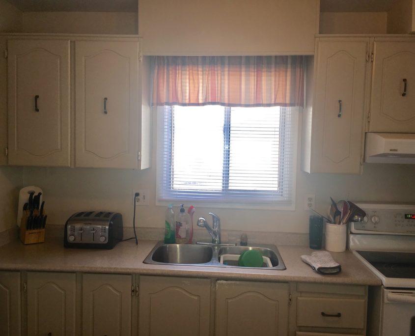
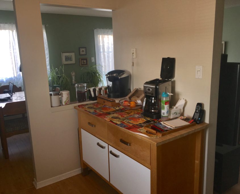
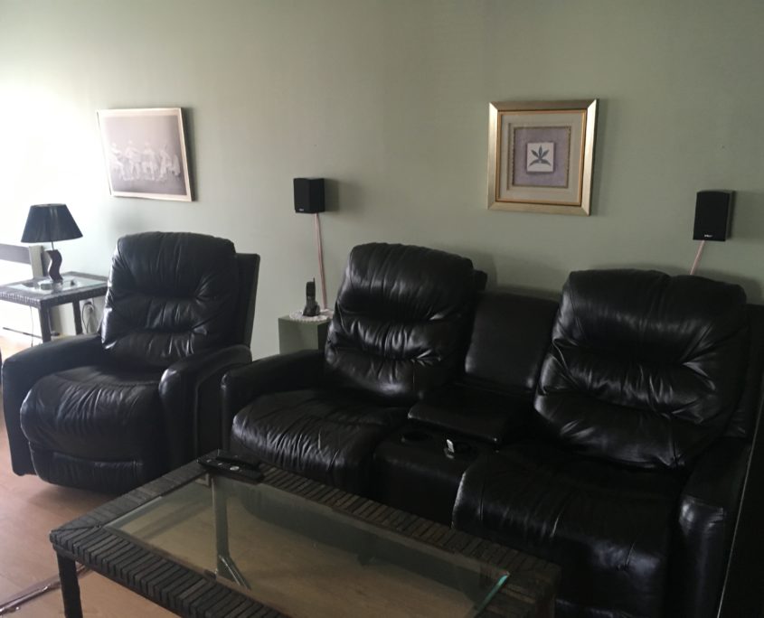
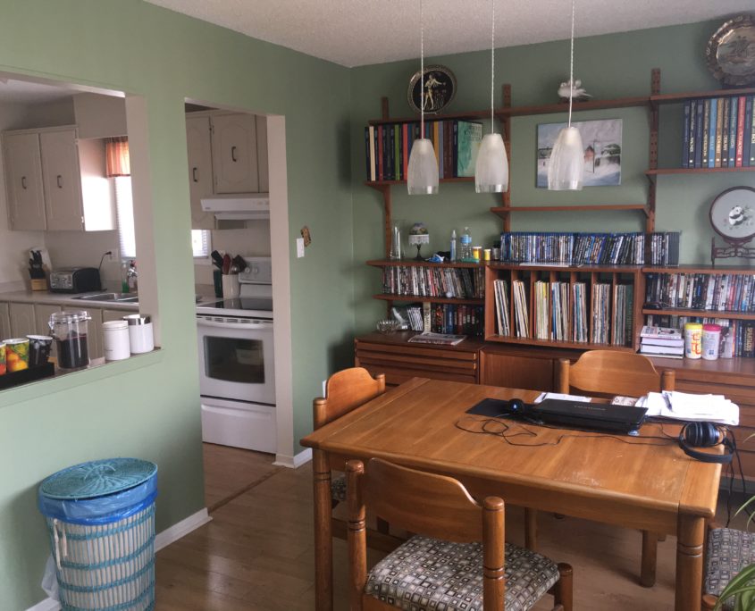
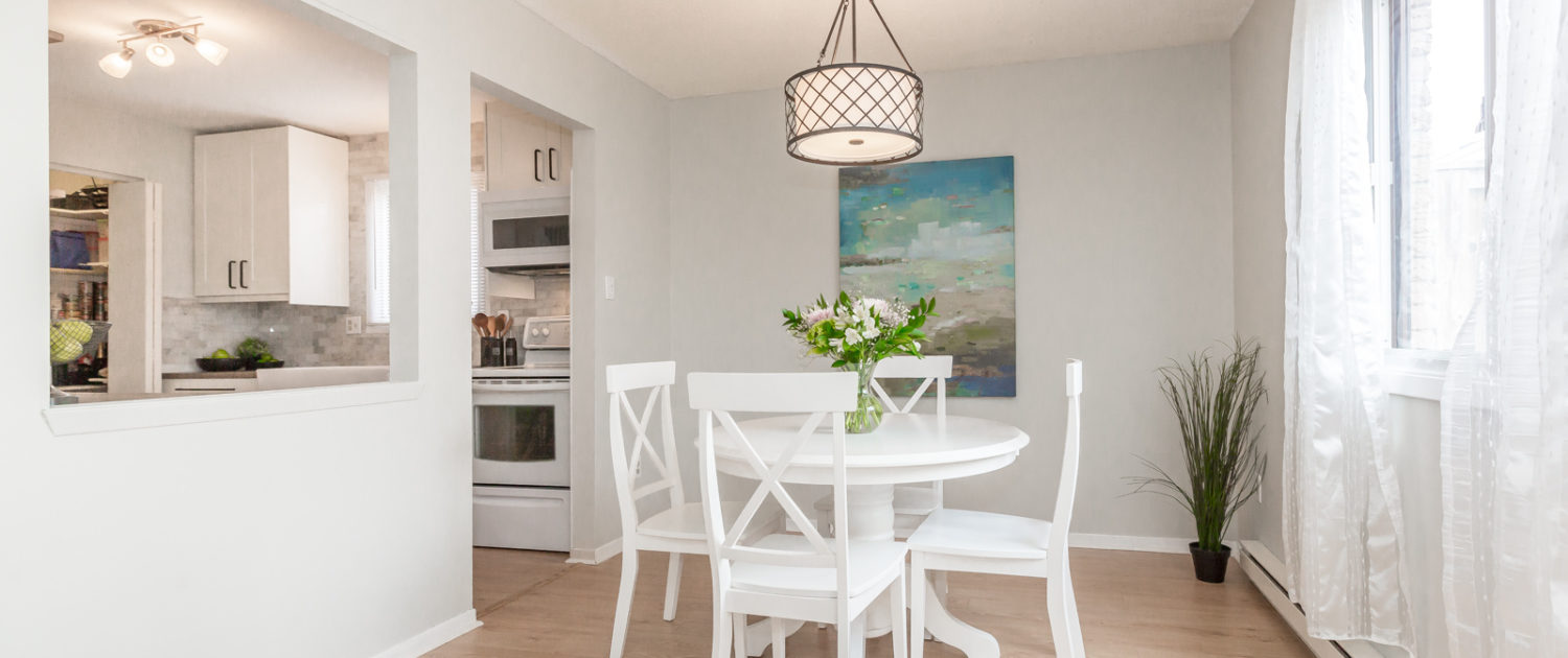
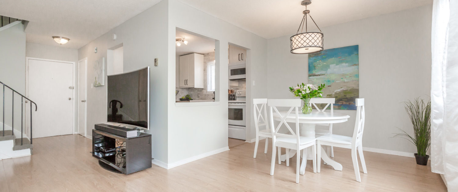
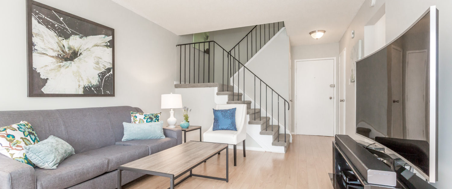
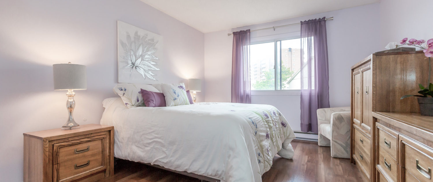
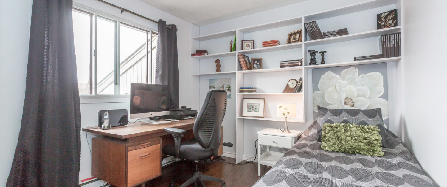
Below is what the home looked like when we met them. As you can see, the house was in great shape, it just needed better furniture arrangements to maximize function and square footage. The paint colour needed to be toned down so that it looked more modern. Having a move in ready paint scheme in incredibly valuable to a new buyer and they will pay for it.
Kitchen Renovation
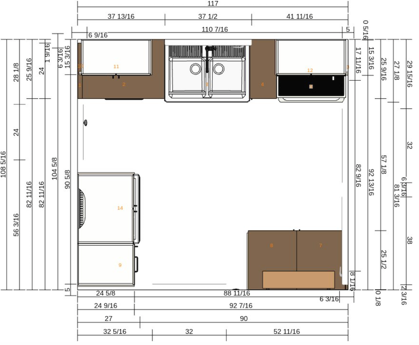
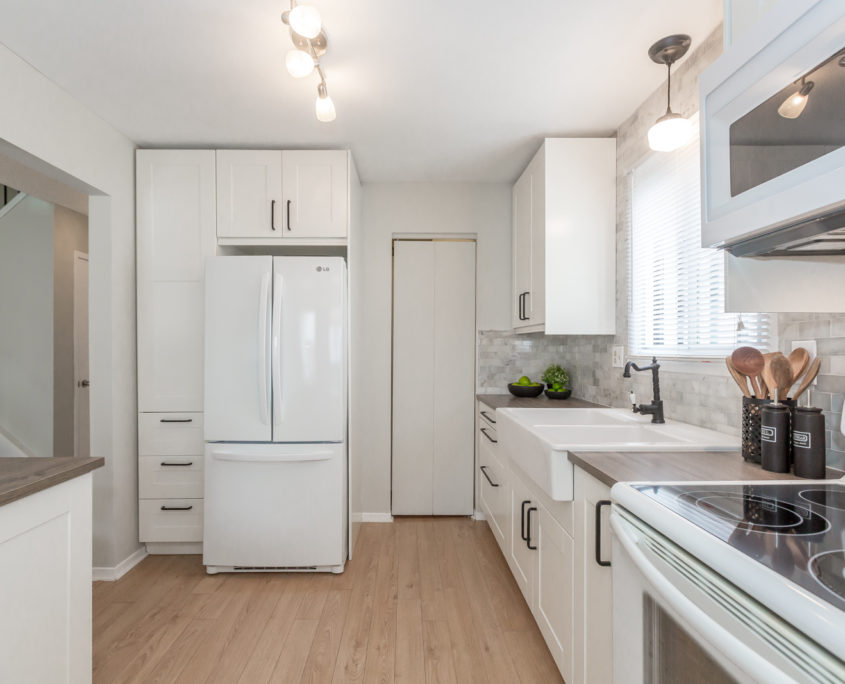
We went straight to work measuring and planning the kitchen. For the level of their home, a nice fresh white IKEA kitchen would more than meet our buyer’s expectations and keep within budget.
Phase I: Design a More Functional Kitchen Layout
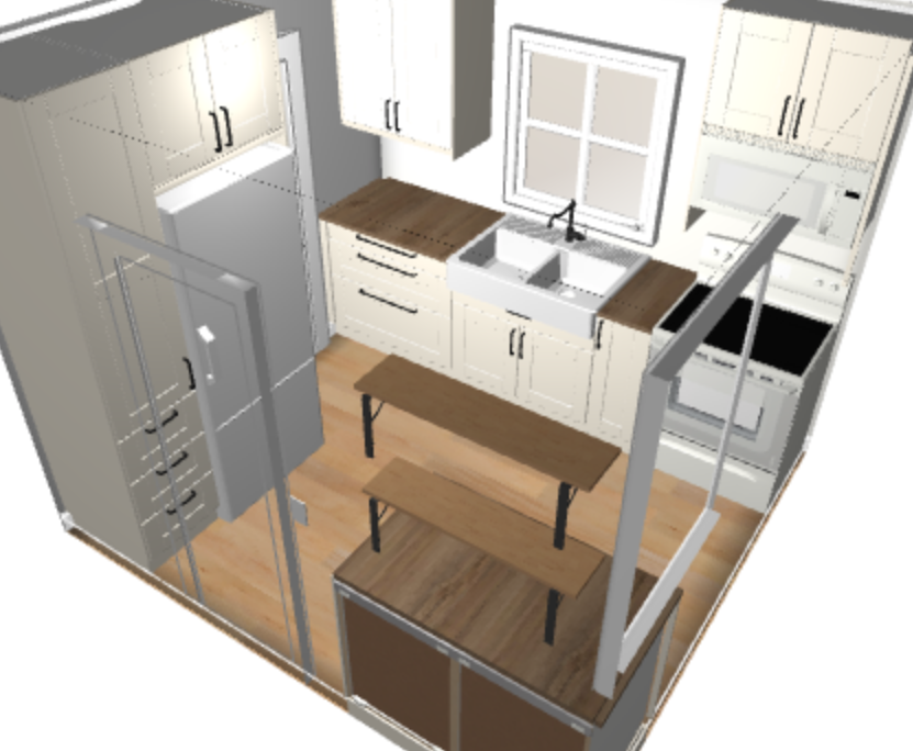
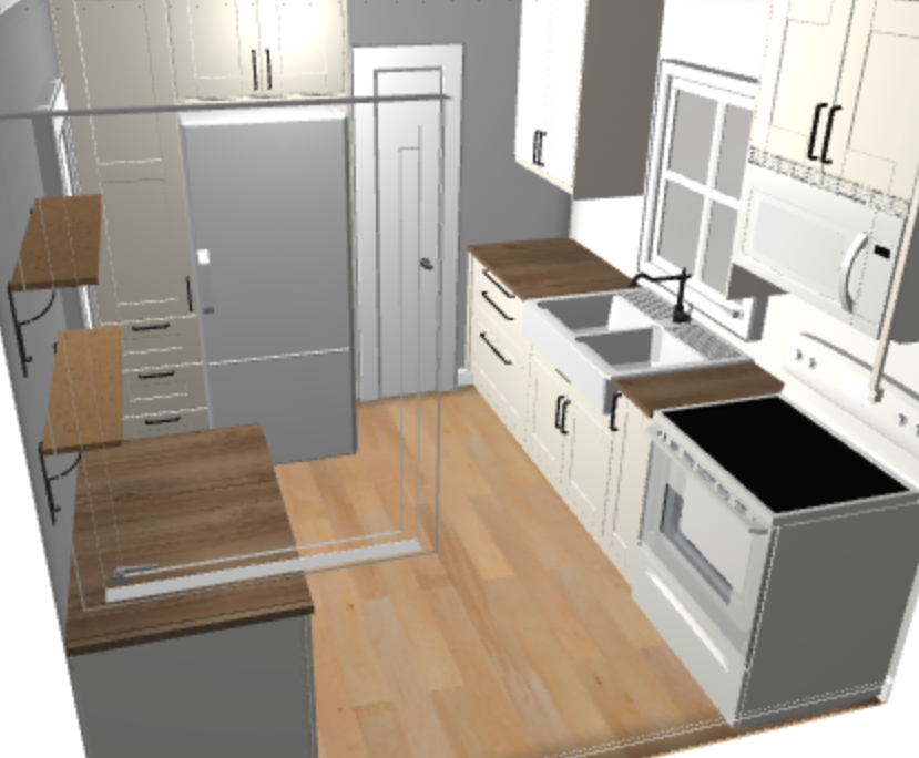
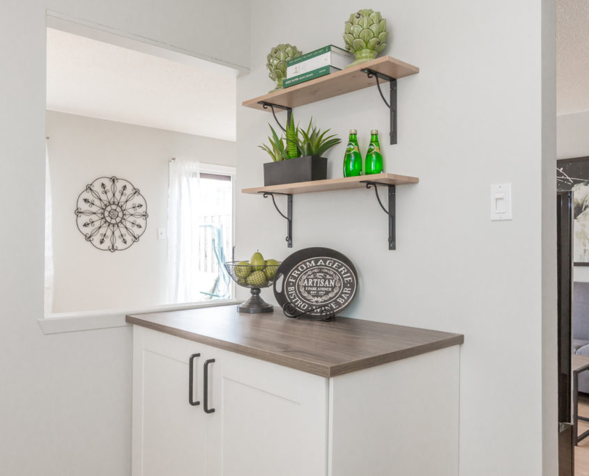
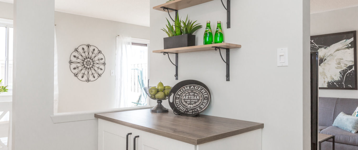
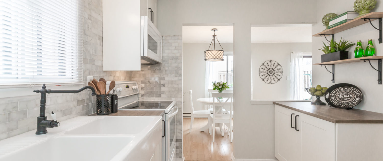
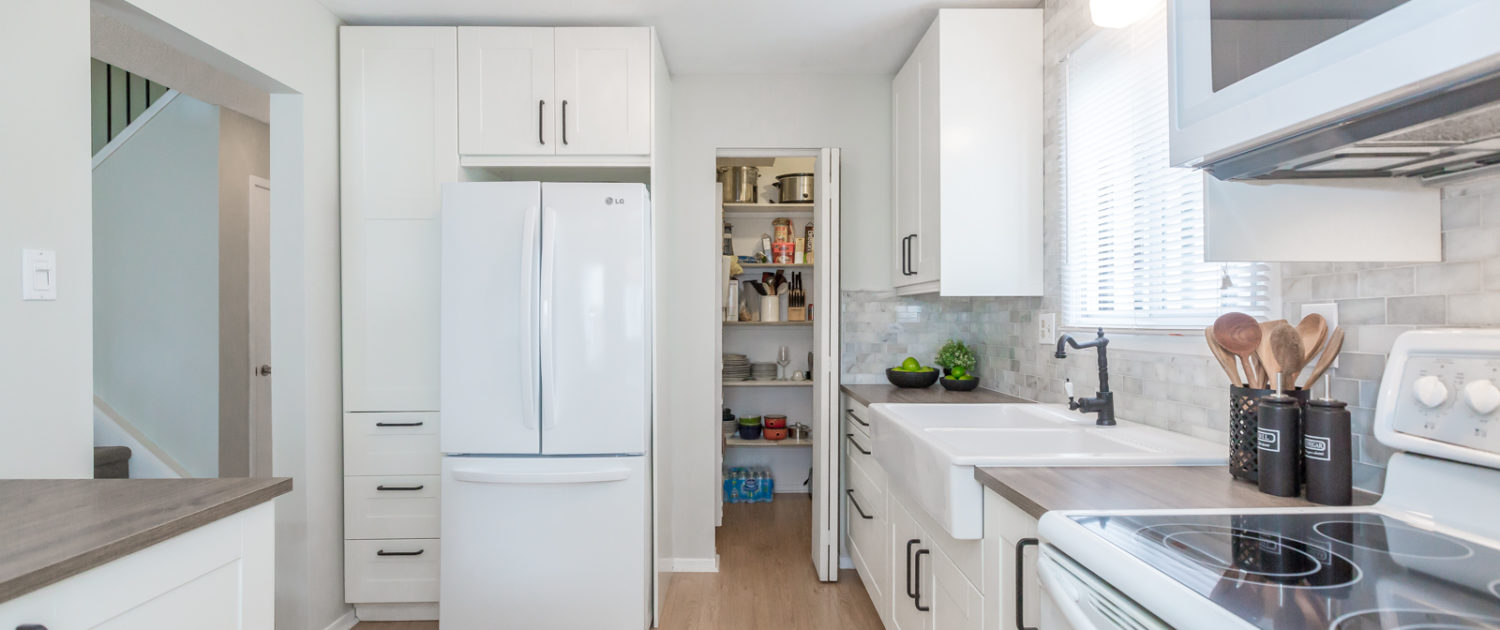
The main goal was to increase storage, counter space and function. We replaced the lower shelf cabinets with drawer cabinets – both open and concealed. We also wanted to incorporate the open opposite wall into the design with added cabinetry to provide permanent storage and counter space. We installed shelves above as a modern touch that added style and kept sight lines to the dining room open. By choosing a range microwave, we could remove the counter microwave and increase the pantry size by the fridge. We also slid the fridge away from the doorway so that the kitchen entrance didn’t feel so narrow.
Phase II: Source & Order Materials
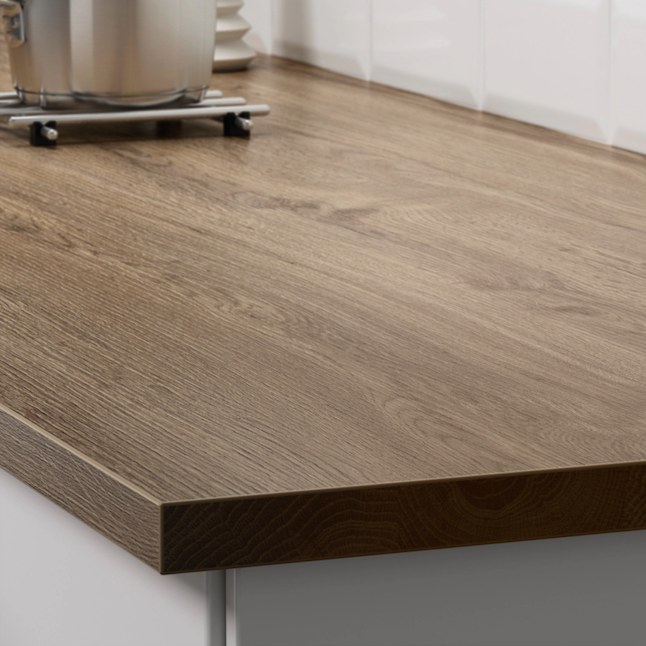
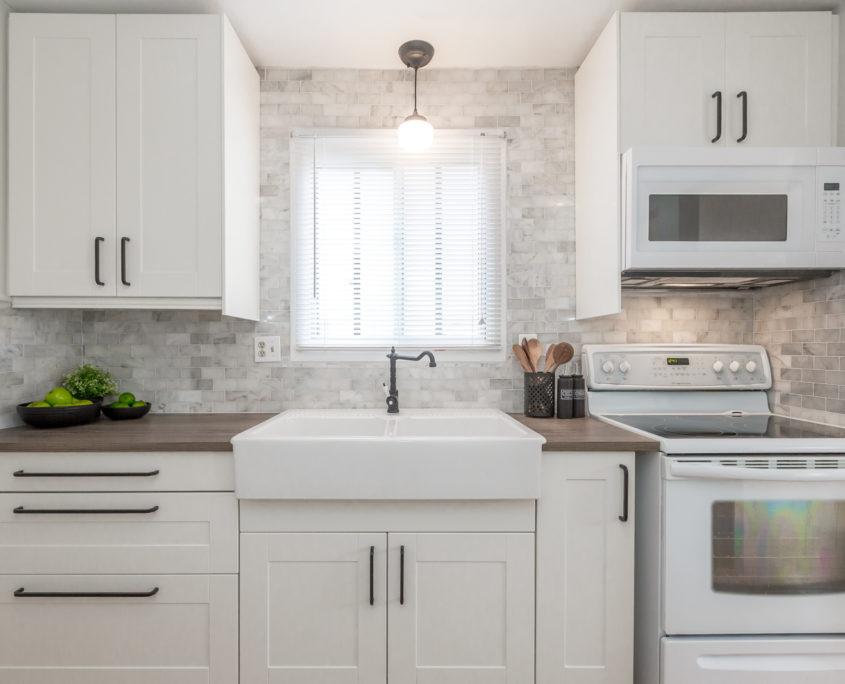
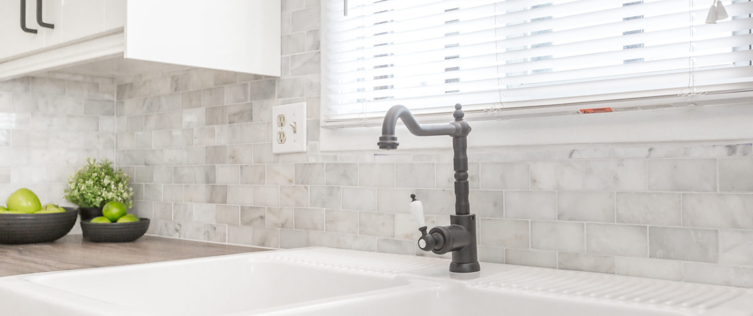
We knew that we were going to use IKEA for the cabinets, and also decided on an IKEA laminate counter with a warm butcher block look. It provided the necessary contrast to the cabinets and the price is amazing. Stone counters are often a budget-breaker when upgrading a kitchen to sell, so it’s important to mix several materials to make the laminate look the best it can – this always means choosing a counter without the Big Box Store style back-kick. A custom-cut or IKEA laminate is well worth the small cost to get that critical modern look.
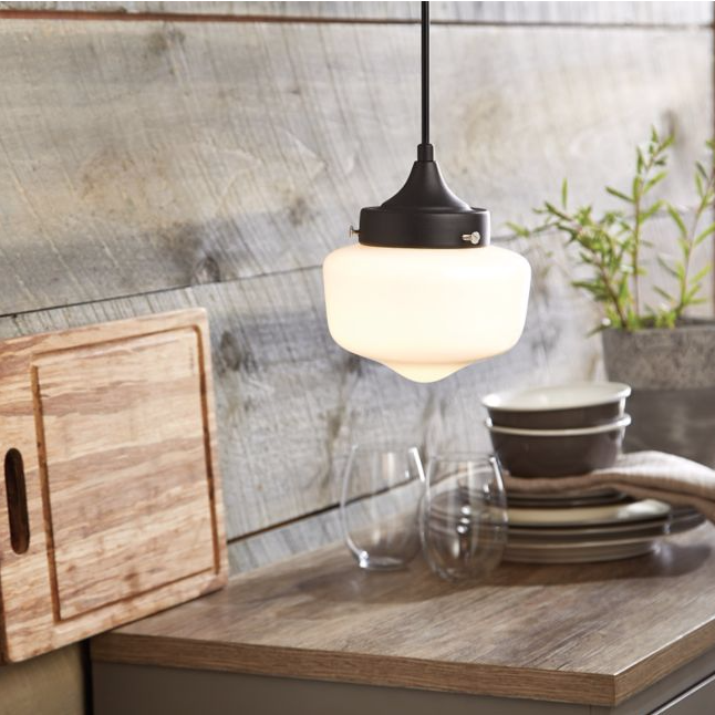
We also found a school house pendant at Canadian Tire for less that $30 that complimented the black metal IKEA door handles. We also loved the farmhouse IKEA sink, which really added a sense of charm to the overall look.
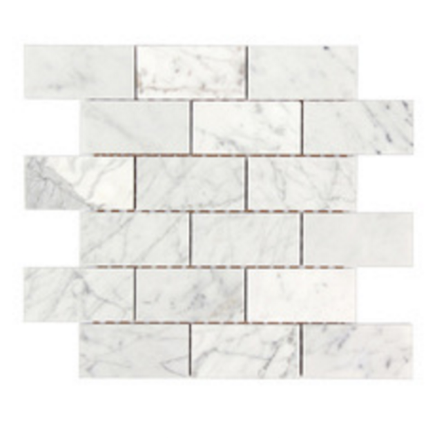
For the backsplash, we found a marble tile for under $12/square foot to ensure there was a sense of elegance and quality in the space. The variety of elements worked together to create an interesting and modern look.
Phase III: Installation
Stephanie works wonders with designing functional spaces and sourcing interesting mixes of materials. But when it comes to turning ideas into reality, we rely on our trusted contractors to make that happen. Stephanie works closely with them, meets regularly to answer questions, and helps problem solve issues that arise. A good working relationship is key to ensuring our contractors produce the vision that’s in her mind’s eye.
Here are a few before and after shots to demonstrate how much value this project added to the home. When you leave the work for the buyer to do, if they even offer on the home, they will easily deduct twice the actual cost of a project to ensure they don’t end up at a loss. This was a situation where the client was willing and capable of doing the work to not only protect their equity, but aim for a top dollar sale.
PAINT
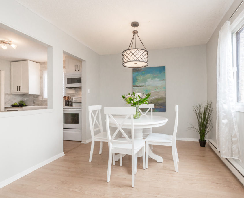
The main floor of the home was a strong green colour, very popular in the late 90’s. When selling a home, we don’t want to have any bold references to how old the house is, because most buyers do not like older homes. Even if they know they have no choice but to buy an older home, if given the choice, they would buy new. So the best thing you can do if you own an older home is to find economical ways to inject a contemporary feeling – and paint is the cheapest and easiest way to do this.
We needed to keep the new colour the green family, because the carpet on the stairs was a dark taupe-green. As ironic as it sounds, if there’s something in your home that you can’t change (tile, carpet) and it’s not a neutral colour, the best way to downplay it is to add MORE of that colour. Think camouflage. If you add any contrasting colour you will draw attention to it even more. The new colour can be a modern, pale, toned version of the bold tile or carpet, but it has to be the same colour family.
Paint Colour Before
GRAY CASHMERE 2138-60
Furniture Update
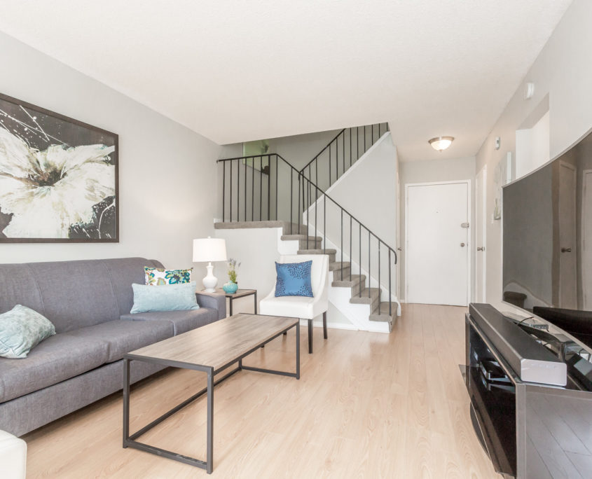
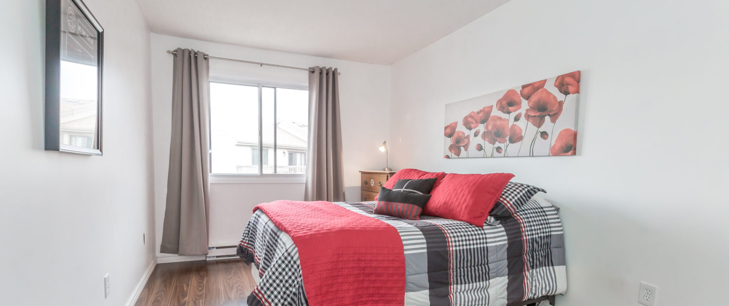
Another dramatic change we made was to remove all of their furniture on the main floor and bring in our prop furniture for staging. This was only possible because they had the storage space to keep their furniture, and they knew they wanted an updated look. We are flexible and work with any scenario but as you can see from the before and after pictures below, furniture absolutely makes a difference in presentation and buyer impressions.
Stephanie has heard many times “Buyers are buying the house, not the furniture”. But what we say, is that buyers are really buying a dream, a lifestyle they crave to have. Everything about the house either shows them this dream, or doesn’t. It’s important to keep top of mind that buying a home is as much an emotional purchase as a logical one, and if you want the highest price for your home, you need to appeal to buyers on both fronts.
The black theatre sofa and chair were even heavier than they looked. We got all hand on deck and dragged them to the storage room down the hall. **Interesting side note – it’s a good idea to ask how much furniture weighs when you’re shopping. Lighter furniture is helpful if you like to move your furniture to clean, entertain, or move.**
The owners removed the massive wall unit because they didn’t want to leave it with the house. It would have left massive holes and they would have had to re-paint again for the new owners, so it’s best to just remove what you want to keep before you do any painting, and then the job is done once.
Lighting
In the photos of the dining room above, you will see that we switched out the pendant light for a modern pendant chandelier. As you look through our portfolio, you will see that we suggest this light all the time, and many of our clients love it and install it for their home. At the time, we weren’t worried about our portfolio and whether you would see the same light 10 times, we were thinking what is the cheapest, best light we can suggest to our clients? and for about $100 at Home Depot, this one wins quite often.
You, as a seller, are the only one who will compare all of our work side by side. With every listing, it’s a fresh set of buyers who have never seen our work before. We focus on getting the most impact for every single dollar you invest in your home. That is what’s most important.

